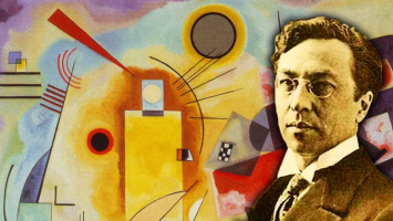
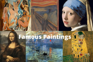
Top 10 Most Famous Paintings by Wassily Kandinsky
Wassily Wassilyevich Kandinsky, a Russian artist who lived from December 16, 1866, to December 13, 1944, is most known for being a pioneer of abstract art and ... read more...for creating some of the genre's early pieces, such as the painting known as the First Abstract Watercolor. Around the turn of the 20th century, Kandinsky started his artistic career. He began by creating woodblock prints and Impressionist landscape paintings. The Blue Rider is one of his earliest works that is most well-known. Kandinsky gradually shifted toward abstraction as he began to feel that "things destroyed pictures." Kandinsky had a strong spiritual connection to art, and many of his creations included music. He was moved by color and thought that it could express feelings. Kandinsky was one of the most influential painters of the 20th century and he has been called the Father of Abstract Art. Here are his 10 most famous paintings including works from his renowned Composition series.
-
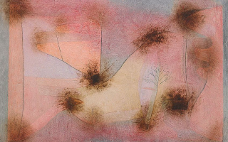
Paintings like Composition X from 1939 and beyond are largely focused on inspiring a spiritual resonance in both the viewer and the artist. By translating these epic myths into modern language, Kandinsky, as in his painting of the apocalypse by water (Composition X), places the observer in the experience of experiencing these epic myths (with a sense of desperation, flurry, urgency, and confusion). Within the constraints of words and visuals, this spiritual communion of viewer-painter-artist/prophet may be described.
Kandinsky frequently compared the creation of beautiful music to the act of painting colors and images on a canvas, and as a result, many of his works bear variations of the title Composition. His metaphor for art as a musical composition focused around the piano: the spirit was the piano and strings, the eyes were the hammers, and the color was the keyboard. Similar to how music is not just random notes strung together, Kandinsky's artworks were not merely jumbles of colors and shapes. They were musical elements that had been meticulously arranged and proportioned to elicit the viewer's highest level of aesthetic and emotional reaction.
Location: Kunstsammlung Nordrhein-Westfalen, Dusseldorf, Germany
Style: Abstract
Year: 1939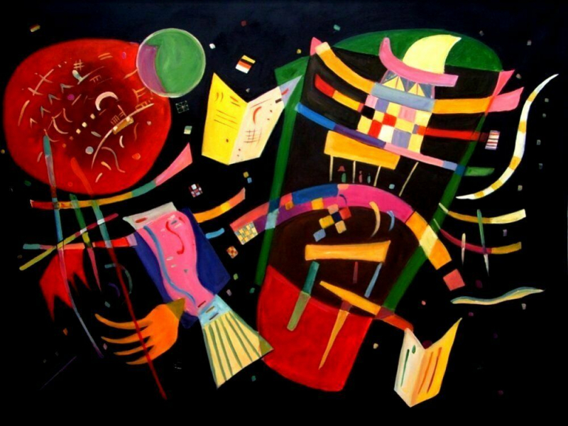
Source: eBay 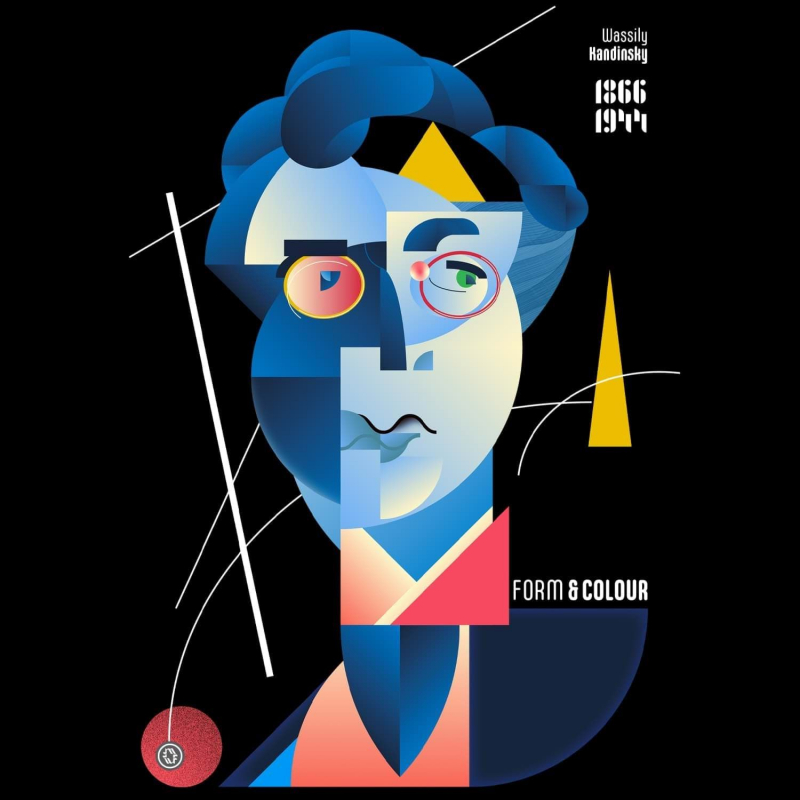
Source: pinterest.fr -
This picture, which is regarded as a turning point in 20th-century modern art, features many geometric shapes in a stunning color palette. White was a color used by Kandinsky to signify silence, tranquility, and vitality. His paintings' use of black alludes to a lack of alternatives. Black, which is used to represent death and how all of those potential might be taken away, is supposed to represent the opportunities of life in this picture. While black might represent emptiness, white can also represent tranquility. In the early 1920s, Kandinsky began to incorporate geometric themes more frequently in his works of art, and On White II is one of the most well-known of his numerous abstract geometrical pieces.
Black and white, the painting's two primary hues, are cleverly combined in Kandinsky's On White II. In his paintings, Kandinsky incorporated color to depict more than simply patterns and figures. The many shades of white are employed in this artwork to symbolize the many possibilities and chances that exist in life. On the other side, the color black stands for oblivion and passing away. In this picture, the black shatters the tranquility of the brilliant mixture of colors, or as it were, opportunities in life, by tearing through the white background with a riotous impact. Kandinsky described the color black as the silence of death.
Location: Georges Pompidou Center, Paris, France
Style: Geometric Abstraction
Year: 1923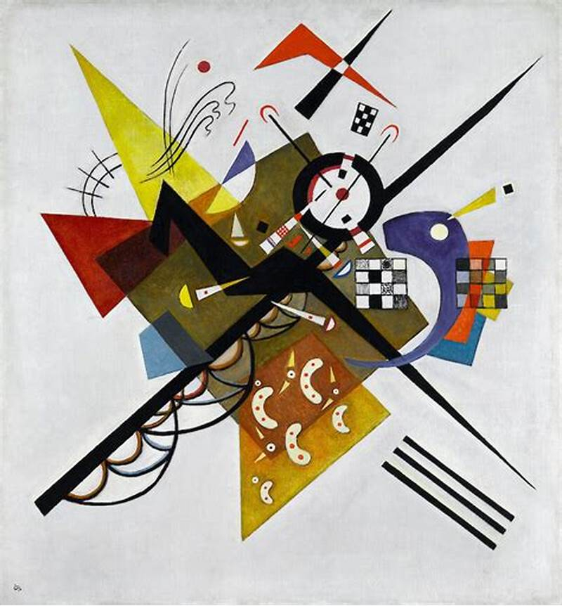
Source: arthistoryproject.com 
Source: shop.bauhaus-movement.com -
After moving back to Germany from Russia in the early 1920s, Kandinsky's works began to take on a distinctive geometric quality, more space began to appear on the canvas, and spontaneity gave way to order. The painter continued his investigation into the interaction and effect of the primary components of the canvas, the colors and forms, since he was fascinated by the educational process and theoretical work at Bauhaus. In his "Several Circles," the painter brought to life his own theoretical investigations. By purposefully confining himself to just one shape, the circle, Kandinsky concentrated all of his attention on other elements that make up the composition, such as colors and masses and where they are placed on the canvas in relation to one another. In addition, “Several Circles” unlike many of Kandinsky’s abstract works have no any objective connotations. It is a pure abstraction.
The circle is the synthesis of the greatest oppositions, according to Kandinsky. It blends the eccentric and concentric in an equilibrium and in a single form. It most directly identifies the fourth dimension out of the three fundamental types. Kandinsky created a set of ten images in the 1920s in which the circle is the only form. His most significant piece for expressing the essence of the circle is the picture Several Circles, which represents the culmination of this series. The picture is made up of several circles that have been thoughtfully arranged on a black backdrop, which makes them appear larger to the viewer. A perfect illustration of Kandinsky's emphasis on the expressive character of abstract forms is Several Circles.
Location: The Guggenheim, New York, United States
Style: Geometric Abstraction
Year: 1926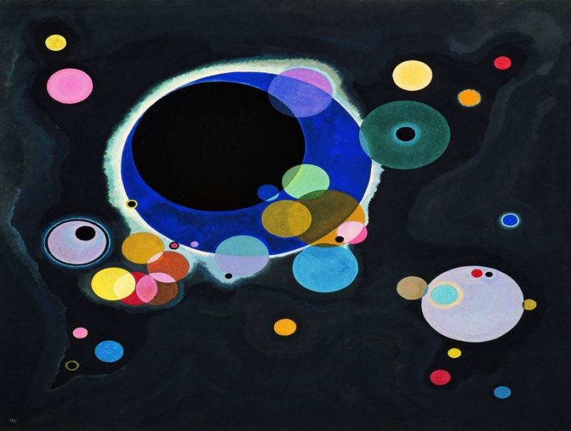
Source: obrazynaplatne.cz 
-
Wassily Kandinsky produced the Yellow-Red-Blue painting in 1925. On the artwork, the primary colors are used to depict squares, circles, and triangles, along with some abstract shapes. Black lines that are both straight and curved also cut through the colors and shapes. This is done to encourage the viewer to reflect deeply on the work. Due to the differences between each side, Yellow, Red, and Blue can truly be divided in half. Brightly colored rectangles, squares, and straight lines may be seen on the left side, while numerous abstract shapes in darker hues can be seen on the right side. These two sides exhibit various influences and aim to elicit a range of feelings in the observer.
At the Bauhaus in 1925, Kandinsky taught the introductory design course for novices and the advanced theory course. He also led painting lessons and a workshop where he expanded his color theory with fresh form psychology concepts. His second theoretical book, Point and Line to Plane, was published in 1926 as a result of the advancement of his works on forms studies, notably on points and line forms. In both his teaching and painting, geometrical elements—particularly the circle, half-circle, angle, straight lines, and curves—became increasingly important. It was a really fruitful time. His handling of planes with vibrant hues and gradations, such as in Yellow-Red-Blue, are indicative of this independence (1925), where Kandinsky illustrates his distance from the constructivism and suprematism movements influential at the time.
The two-meter-wide Yellow-Red-Blue consists of several main forms: a vertical yellow rectangle, an inclined red cross and a large dark blue circle; a multitude of straight (or sinuous) black lines, circular arcs, monochromatic circles and scattered, colored checkerboards contribute to its delicate complexity. This simple visual identification of forms and the main colored masses present on the canvas is only a first approach to the inner reality of the work, whose appreciation necessitates deeper observation - not only of forms and colors involved in the painting but their relationship, their absolute and relative positions on the canvas and their harmony.
Location: Georges Pompidou Center, Paris, France
Style: Geometric Abstraction
Year: 1925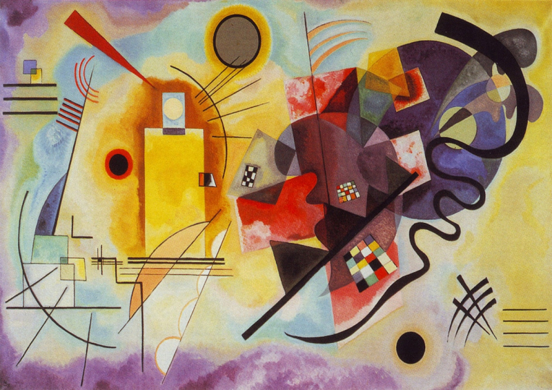
Source: etsy.com 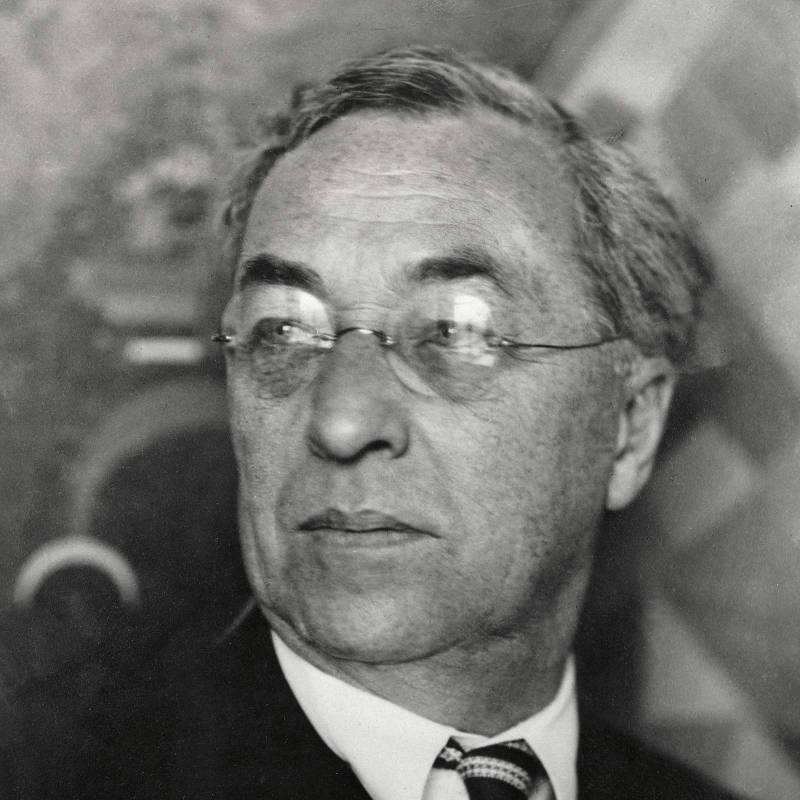
Source: jeannebucherjaeger.com -
In this piece, Kandinsky again plays whimsically with geometric forms, similar to his contemporary piece Aufsteig. He was supposed to pen the line, "I do not select shape intentionally, it chooses itself in me," this year. A semicircle that is delicately yet unsteadily placed on the point of a triangle makes up the artwork. It is offset by a thin rectangular strip and a smaller orange segment that, despite being smaller in area, together seem to balance the semicircle flawlessly.
Kandinsky carefully selects his colors for this precise balance, which raises the apparent density of the smaller portion. Its overhanging semicircle restricts and lengthens its upward movement, hence the title. A horizontal line that further bisects the semicircle draws our attention to its central axis, and its tension with the vertical that maintains the balance. By this Kandinsky achieves both a tension and a synthesis in the work. There is also a sense of a human face in this work, the 'heavenly' blue circle and aura depicting the eye and the narrow red rectangle representing a mouth, reminiscent of an earlier work by Paul Klee.
Location: Peggy Guggenheim Collection, Venice, Italy
Style: Geometric Abstraction
Year: 1929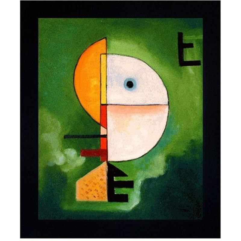
Source: Pinterest 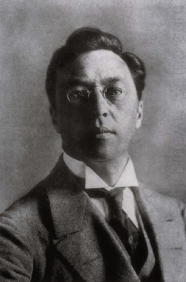
Source: arthistoryproject.com -
The Blue Rider (1903), which depicts a small cloaked man galloping over a rocky meadow on a horse, is possibly the most significant of Kandinsky's works from the first decade of the 1900s. The shadow made by the rider's medium-blue cloak is darker-blue in color. The fall-colored trees in the backdrop are mirrored by more amorphous blue shadows in the foreground. The horse's stride looks odd, and the blue rider in the artwork is prominent but not properly defined.This ground-breaking piece marked a turning point in Kandinsky's evolving style. He clearly showed aesthetic affinities with the Impressionists' work in this picture, particularly in the contrasts between light and dark on the hillside covered with sun. And many of Kandinsky's early works were influenced by the impasto-heavy paintings of Vincent van Gogh. In many of his later works, the horse and rider motif recurred. This pattern represented Kandinsky's opposition to traditional aesthetic standards as well as the potential for a purer, more spiritual life through art.
Location: Private Collection
Style: ImpressionismYear: 1903
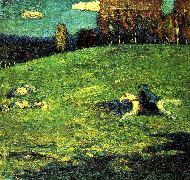
Source: blogspot.com>Counterlight 
Source: Pinterest -
Wassily Kandinsky intentionally left this artwork nameless. His 1913 picture Composition VII was the subject of the investigation. Untitled is the proper title for the piece (Study for Composition VII, Premiere Abstraction). Because it is widely regarded as the first wholly abstract painting, the piece has come to be known as the First Abstract Watercolor. While this may not always be the case, it is undeniable that this picture was among the first to completely disregard all allusions to well-known forms from the Western European representational tradition. In Kandinsky's parallel series of abstract "Compositions" and "Improvisations," it is the first surviving piece. Although critics might not consider it to be one of his best pieces, First Abstract Watercolor is definitely one of the most famous paintings of Kandinsky; the one which makes him the Father of Abstract Act in popular belief.
The watercolor that Kandinsky signed, dated 1910, and labeled "abstract watercolor" on the back has long been regarded as the very first abstract work in the history of art. Today's scholars, however, concur that it truly dates from 1913 and was created as a sketch for Composition VII, an oil on canvas. This watercolor's aesthetic and effective use of space imply that it is more reminiscent of Kandinsky's 1913 paintings. It separates the functions of drawing and color through the use of watercolor touches layered with black pen and ink lines. The shapes are given a rhythmic feeling of movement through the lines rather than outlines. This is a common feature of works dating from after 1912: before then, the colors remained structured by images, which referenced Kandinsky's memory and personal recollections.
Location: Georges Pompidou Center, Paris, France
Style: Abstract
Year: 1910 or 1913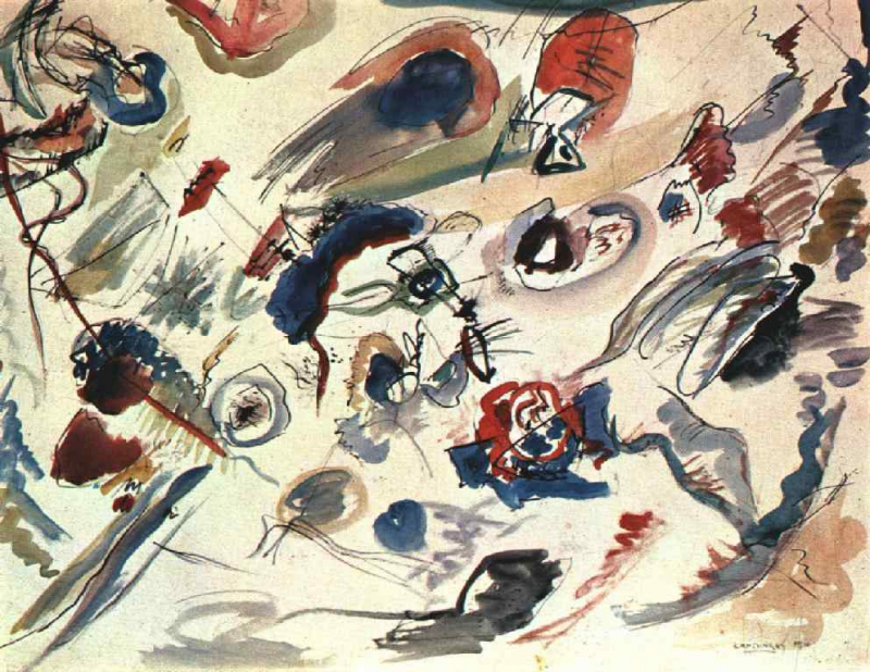
Source: wikiart.org 
Source: youTube>Mediateca Santa Teresa Biblioteca Nazionale Braidense -
Wassily Kandinsky’s artwork, Color Study: Squares with Concentric Circles was painted in 1913 using watercolor, gouache, and crayon on paper. It is touted as one of the most famous works by the artist. The rings all share a center point inside these divisions since there are 12 separate parts of squares with concentric circles. This artwork, which is regarded as striking the ideal harmony of shape and color, contrasts not only various shapes with one another, as seen by the artist's use of squares and circles, but also vivid colors and their interactions. The artist also used triad tones, which are also primary shades of red, blue, and yellow, complimentary colors like blue and orange, analogous hues of red and orange, and complementary colors like orange and blue.
However, each pigment's brightness and intensity varies from circle to circle. The title of the artwork itself provides some context for the subject. It is a study or an examination that he could use as a tool while he examined other paintings to see how one hue interacts with another. But the artwork eventually developed into a finished piece that is praised for its original methodology. The geometric shapes in the picture have an almost random, organic sense to them. His use of gouache and watercolors only serves to amplify this impression, particularly given how the watercolors blend into one another. This method also gives light on Kandinsky's study of the interaction between colors and how it affects the spectator.The artist himself acknowledged that his painting had a dual effect. Upon first glance, spectators would most likely be drawn to the physical impact brought about by his use of color. In a way, this evokes a physical reaction as if colors can be heard as well as seen, which is consistent with synesthesia, meaning having the ability to experience more than one sense at a time.
Location: Lenbachhaus, Munich, Germany
Style: Abstract
Year: 1913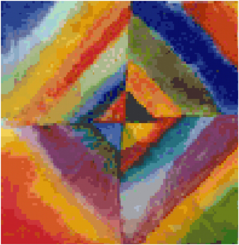
Source: Etsy| 
Source: gittermangallery.com -
Composition VIII is a little oil work by Wassily Kandinsky. The eighth painting in the series that started in 1911, it was created in 1923. The painter sought to express his views on music and its beauty through painting. Large concentric circles are used in this composition, and each one is given a distinct color. The artwork, which is on display at the Guggenheim Museum in New York, is a superb example of abstract expressionism.
The geometric shapes in Kandinsky's artwork strive to create a universal aesthetic language that is both hostile and serene. The circle, a key element in the composition, is crucial because it enables the creative synthesis of powerful oppositions. The artist characterized the circles as a unique combination of the “concentric” and “eccentric” and described it as a “meditative state of the human spirit”. Even though Composition VIII is a well-known work today, it is unclear whether it was finished before 1919. The artist lived in Germany for a while before returning to Russia at the start of the war. He had some time to consider his life and his art after the war. Composition VIII is a piece that is highly recommended for all art students since it ultimately demonstrates how internalized Kandinsky's vision was.
The composer meant the piece to be a portrayal of a musical moment, despite the somewhat ambiguous title. He was depressed at the time, and that time is reflected in the song. He remained in Germany for a number of years after the war. Upon his return, he began to write again. The composition VIII is influenced by his work in the nine years before the First World War. Composition VIII reflects his influence from the Bauhaus School. It combines elements of abstract art with the ethos of the Bauhaus. It is also the first of Kandinsky’s works after the First World War. It is a work that focuses on the idea of the Bauhaus and the ethos of the Bauhaus movement. This painting demonstrates the influence of both modernist movements on the artist.
Location: The Guggenheim, New York, United States
Style: Geometric Abstraction
Year: 1923
Source: zhihu.com 
Source: pinterest.com -
Composition VII must be regarded as Kandinsky's pinnacle in terms of scale, amount of preparatory effort, complexity of ideas, subjective engagement, and, last but not least, as an objective graphic entity. It is without a doubt the pinnacle of his artistic accomplishments during his time in Munich. There are approximately fifteen variations of linked motifs in such diverse mediums as glass paintings, drawings, watercolors, woodcuts, and oils, excluding the sketches and studies for Composition VI (whose aspects of Deluge and Resurrection also figure in Composition VII). Eschatological ideas are at the center of each of these. We are aware of approximately thirty drawings and watercolors for Composition VII alone, some of which are in-depth studies that resemble those of the classic masters Caravaggio, Leonardo da Vinci with minuscule depictions of human body folds, foliage, or limbs. There are some pages that consistently repeat a single curving line up to 10 times; others display schematic sketches of the composition's essential structural components; still other sheets contain comprehensive instructions for priming the canvas.
Additionally, there are at least 10 substantial oil studies, some of which are difficult to place in Composition VII but which are all undoubtedly connected to it either by their inscriptions or by their morphological details. Miinter recorded in her diary on November 25, 1913, that Kandinsky had begun working that evening and that the canvas for Composition VII had arrived after dinner. The next morning she took the first photograph of the painting and in the afternoon the second one. Her diary entry on the 28th recorded that the painting had been completed. The following morning she took a photograph of the final state. The birth of a great masterpiece had to be recorded.
Location: Tretyakov Gallery, Moscow, Russia
Style: Abstract
Year: 1913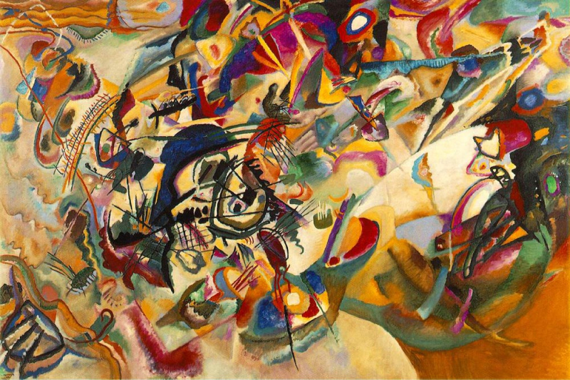
Source: totallyhistory.com 
Source: jeannebucherjaeger.com