Yellow - Red - Blue
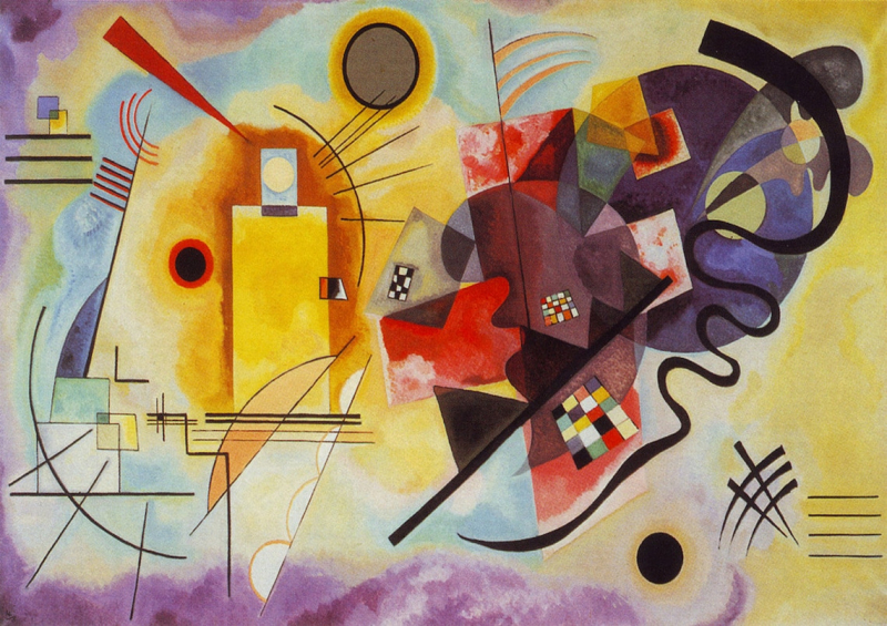
Wassily Kandinsky produced the Yellow-Red-Blue painting in 1925. On the artwork, the primary colors are used to depict squares, circles, and triangles, along with some abstract shapes. Black lines that are both straight and curved also cut through the colors and shapes. This is done to encourage the viewer to reflect deeply on the work. Due to the differences between each side, Yellow, Red, and Blue can truly be divided in half. Brightly colored rectangles, squares, and straight lines may be seen on the left side, while numerous abstract shapes in darker hues can be seen on the right side. These two sides exhibit various influences and aim to elicit a range of feelings in the observer.
At the Bauhaus in 1925, Kandinsky taught the introductory design course for novices and the advanced theory course. He also led painting lessons and a workshop where he expanded his color theory with fresh form psychology concepts. His second theoretical book, Point and Line to Plane, was published in 1926 as a result of the advancement of his works on forms studies, notably on points and line forms. In both his teaching and painting, geometrical elements—particularly the circle, half-circle, angle, straight lines, and curves—became increasingly important. It was a really fruitful time. His handling of planes with vibrant hues and gradations, such as in Yellow-Red-Blue, are indicative of this independence (1925), where Kandinsky illustrates his distance from the constructivism and suprematism movements influential at the time.
The two-meter-wide Yellow-Red-Blue consists of several main forms: a vertical yellow rectangle, an inclined red cross and a large dark blue circle; a multitude of straight (or sinuous) black lines, circular arcs, monochromatic circles and scattered, colored checkerboards contribute to its delicate complexity. This simple visual identification of forms and the main colored masses present on the canvas is only a first approach to the inner reality of the work, whose appreciation necessitates deeper observation - not only of forms and colors involved in the painting but their relationship, their absolute and relative positions on the canvas and their harmony.
Location: Georges Pompidou Center, Paris, France
Style: Geometric Abstraction
Year: 1925


