Data Visualization in Excel

It is one of the best online lookup table courses for anyone interested in learning more about lookup table. They need to cut through the noise and show vital information in a way that can be swiftly ingested and acted upon in this age of "big data," making data visualization an increasingly important talent. Not only must visualizations provide data in an understandable and appealing manner, but they must also give context for the data and tell a story, striking that delicate balance between form and function. Excel has a lot of competitors in this market, but it's still a great option, especially if your data is stored there. It has a variety of tools for producing visualizations other than charts, and the chart possibilities are continually expanding and improving, with current versions now including waterfall charts, sunburst diagrams, and even map charts.
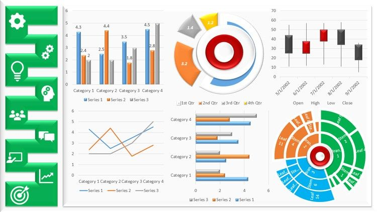
But it's Excel's versatility that sets it apart; it allows us complete creative control over designs, allowing us to create own dynamic custom chart if necessary to convey the correct story with data. Over the course of five weeks, they will look at Excel's extensive visualization features through real-world case studies as viewed through the eyes of Rohan, an environmental analyst. Rohan is expected to provide visualizations for a wide range of environmental data sets, including trends, projections, breakdowns, and comparisons. He wants to employ conditional formats, sparklines, specialized charts, and even develop his own animated charts and infographics in addition to the standard chart kinds. He may also need to prepare the data using pivot tables in order to drill down and answer highly precise inquiries in some circumstances. They will assist him in doing all of this, and they will offer final visualizations in appealing reports and dashboards that make use of automation and interaction tools such as slicers and macros.
The following are the subjects they shall discuss:
- Week 1: Conditional formatting, bespoke number formatting, sparklines, and macros for dynamic visualizations
- Week 2: Developing approaches for conveying the best tale possible
- Week 3: Creating unique and specialized charts
- Week 4: Using pivot tables and pivot charts to summarize and filter data
- Week 5: Using Excel to create interactive dashboards
This is the second course in Data Analytics and Visualization Specialization. The first course, Excel Fundamentals for Data Analysis, covers data preparation and cleaning as well as some of the course's requirements, such as tables and named ranges, as well as text, lookup, and logical functions. They recommend that you take the first course or have prior knowledge of these topics to get the most out of this one. Join us on this fascinating adventure as they focus on Data Visualization in Excel in this course.
- Flexible deadlines: Reset deadlines based on your availability.
- Shareable certificate: Get a Certificate when you complete
- 100% online: Start now and learn when it's convenient for you.
- Course 2 of 3 in the: Excel Skills for Data Analytics and Visualization Specialization
- Intermediate level: They expect that you have some background with Excel. You can move around the interface and create basic formulas.
- Approx. 6 p.m. to complete
- Subtitles: English
THE SKILLS YOU WILL DEVELOP:
- Microsoft Excel
- Data Visualization (DataViz)
Rating: 4.9/5
Enroll here: coursera.org/learn/excel-data-visualization