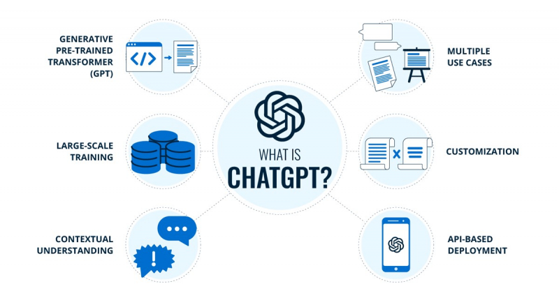
Explaining Infographics
Infographics like pie or bar charts may quickly provide in-depth explanations, which is very helpful for educators and students. ChatGPT can not only deconstruct the visual data for you; on request, it can also provide a detailed explanation of specific portions. However, as data inaccuracy is one of the most frequent issues with ChatGPT, we advise you to treat specifics like figures with a grain of salt. They are designed to present complex concepts, data sets, or processes in a visually appealing and simplified manner. Here's an explanation of the key elements and purposes of infographics:
- Visual Elements
- Information Organization
- Data Visualization
- Simplification and Summarization
- Storytelling
- Visual Hierarchy
- Call to Action or Conclusion
- Branding and Design Consistency
- Shareability and Social media friendliness
Presenting information in an easily readable and visually appealing style is the primary objective of an infographic. Infographics use visual components, data visualization strategies, simplicity, and efficient organization to make difficult subjects easy to understand and help readers remember the main points. They are a powerful instrument for communication and knowledge transmission that are frequently used in marketing, education, journalism, and other industries.


