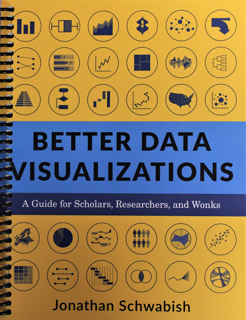
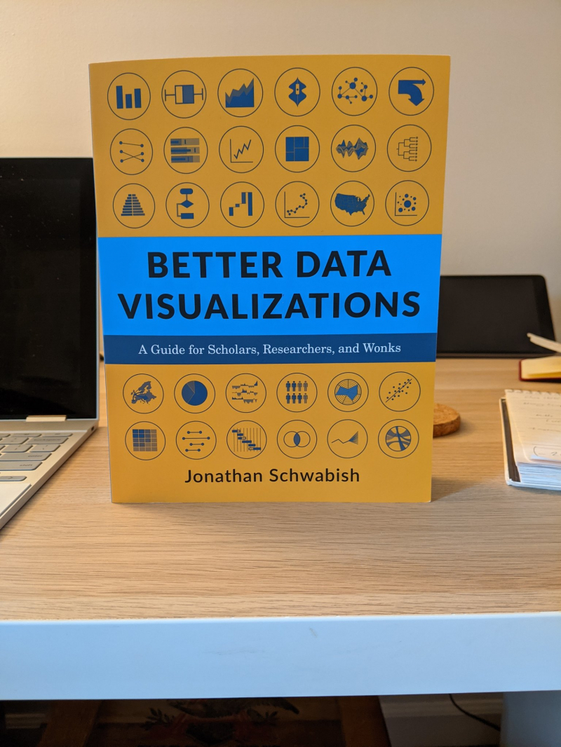
Better Data Visualizations
Jonathan Schwabish is a writer, teacher, and designer of policy-relevant data visualizations. He works with organizations, research institutions, and governments at all levels to enhance how they communicate their work and findings to coworkers, partners, clients, and constituents. Better Presentations: A Guide for Scholars, Researchers, and Wonks is his book.
If content is to spread far, it must be visual now more than ever. Readers everywhere are being inundated with data, news, and information. Visuals can help readers recognize and recall information by cutting through the clutter. However, many researchers were never taught how to graphically convey their work.
One of the best books on business communication, Better Data Visualizations outlines key principles for creating more effective data visualizations. Jonathan Schwabish leads readers through the process of making better graphs and moving beyond simple line, bar, and pie charts. He demonstrates the dos and don'ts of data visualization, the foundations of visual perception, and how to make subjective style decisions around a chart's design using over 500 examples. Schwabish examines more than eighty visualization forms, including histograms, horizon charts, ridgeline plots, and choropleth maps, and explains how each fits within the visual toolbox. Although it may appear intimidating, anyone can learn how to build engaging, effective data visualizations. This book will help you establish your audience and goals, select the appropriate graph for your data, and properly explain your message.
Author: Jonathan Schwabish
Link to buy: https://www.amazon.com/Better-Data-Visualizations-Scholars-Researchers/dp/0231193114/
Ratings: 4.5 out of 5 stars (from 218 reviews)
Best Sellers Rank: #19,824 in Books
#1 in Library & Information Science (Books)
#3 in Presentation Software Books
#5 in General Library & Information Sciences


