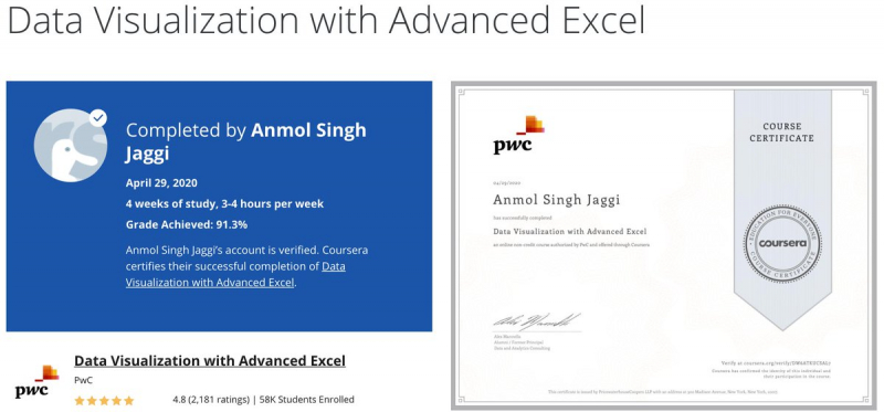
Data Visualization with Advanced Excel by PwC (Coursera)
PricewaterhouseCoopers (PwC) developed this course as part of their Data Analysis and Presentation Skills: the PwC Approach Specialization. This course's purpose is to assist students improve their analytical skills by answering questions and telling a story with their data. Excel is utilized to build data visualization abilities since it is the most extensively used software product and is easily accessible to the majority of learners. This Data Visualization with Excel course includes plenty of hands-on practice with sophisticated Excel 2013 capabilities. It is divided into four weekly modules, each of which takes about four hours to complete. The following subjects are covered in these modules:
- Week1 – This is all about linking data and data models. It covers components of data sets and relational database models and shows how to create databases and data models within Excel using PowerPivot.
- Week 2 – In this week learners will use data to perform various types of scenario and simulation analysis. They will get to practice these skills in Excel by leveraging some of Excel’s built in tools including solver, data tables, scenario manager and goal seek.
- Week3 – This week’s modules focus on data visualization. They cover the basics, outlining the theory and concepts behind data visualization. Also teach how to create detailed graphs and charts to effectively tell a story about your data.
- Week 4 – This week’s lectures use excel to build complex graphs and Power View reports and discuss how to combine them into dynamic dashboards using tools such as form control, slicers and conditional formatting.
At the end of each module, there are various practice activities and quizzes. This course's popularity can be gauged by the fact that it has a 4.8 rating and over 65K students enrolled in it.
Key Highlights
- Understand how to develop a data model using PowerPivot
- Understand the difference between effective and ineffective charting
- Learn to selecting the right type of chart to tell your data story
- Learn how to create column chart, combo chart, stacked column chart, heatmap, gantt project plan and power view reports
- Learn to create your own functional dashboard in Excel
Duration : 4 weeks, 4 hours per week
Coursera Rating : 4.8/5.0
Enroll here: coursera.org/learn/advanced-excel


