Top 11 Best Online Data Visualization Courses

Data Visualization is not just limited to the field of data scientists and data analysts, in all careers whether finance, marketing, tech, design, etc. there ... read more...is a need for data communicators who can visualize data and convey results effectively to both technical and non-technical people. So this is the best time to learn data visualization and be on top of the curve. Here is a list of top 11 best online Data Visualization courses that you should not miss.
-
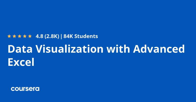
PricewaterhouseCoopers (PwC) developed this course as part of their Data Analysis and Presentation Skills: the PwC Approach Specialization. This course's purpose is to assist students improve their analytical skills by answering questions and telling a story with their data. Excel is utilized to build data visualization abilities since it is the most extensively used software product and is easily accessible to the majority of learners. This Data Visualization with Excel course includes plenty of hands-on practice with sophisticated Excel 2013 capabilities. It is divided into four weekly modules, each of which takes about four hours to complete. The following subjects are covered in these modules:
- Week1 – This is all about linking data and data models. It covers components of data sets and relational database models and shows how to create databases and data models within Excel using PowerPivot.
- Week 2 – In this week learners will use data to perform various types of scenario and simulation analysis. They will get to practice these skills in Excel by leveraging some of Excel’s built in tools including solver, data tables, scenario manager and goal seek.
- Week3 – This week’s modules focus on data visualization. They cover the basics, outlining the theory and concepts behind data visualization. Also teach how to create detailed graphs and charts to effectively tell a story about your data.
- Week 4 – This week’s lectures use excel to build complex graphs and Power View reports and discuss how to combine them into dynamic dashboards using tools such as form control, slicers and conditional formatting.
At the end of each module, there are various practice activities and quizzes. This course's popularity can be gauged by the fact that it has a 4.8 rating and over 65K students enrolled in it.
Key Highlights
- Understand how to develop a data model using PowerPivot
- Understand the difference between effective and ineffective charting
- Learn to selecting the right type of chart to tell your data story
- Learn how to create column chart, combo chart, stacked column chart, heatmap, gantt project plan and power view reports
- Learn to create your own functional dashboard in Excel
Duration : 4 weeks, 4 hours per week
Coursera Rating : 4.8/5.0
Enroll here: coursera.org/learn/advanced-excel
coursera.org 
twitter.com -
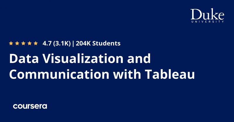
Duke University offers this Data Visualization using Tableau course as part of its Excel to MySQL: Analytic Techniques for Business Specialization. This course's purpose is to enable students to become experts at explaining the business-relevant practical implications of their data studies. It teaches them how to simplify their analysis by asking the correct questions and how to utilize Tableau to communicate key findings. Students learn storyboarding techniques as well as how to depict the outcomes of data analysis or machine learning models in Tableau so that both technical and non-technical stakeholders can understand them.
Tableau is the market's most popular visualization tool. This course looks at many Tableau capabilities that may be used to produce effective visuals that communicate conclusions clearly and immediately. The course is expected to take around 25 hours to complete over the course of 5 weeks. It includes a peer-reviewed final project that evaluates a student's subject learning. The following topics are covered in the course:
- Creating graphs that are used in business analysis
- Transforming data in Tableau
- Designing business dashboards with Tableau
- Creating and delivering compelling business presentations
- How to craft the right questions to ensure your analysis projects succeed
- Writing calculations and equations in Tableau
- Adapting visualizations to make them maximally communicative
Key Highlights
- Understand how to structure your data analysis projects to ensure that they lead to actionable advice that can be presented to stakeholders
- Learn to communicate results and implications of your quantitative analyses visually in a way that non-technical people can understand
- Publish online business dashboards with Tableau
- Learn a set of tools and concepts that you can use to optimize your visualizations and your presentation style
- Series of practice exercises that involves doing analyses on a sample data set
Duration : Approx. 25 hours
Coursera Rating : 4.7/5.0
Enroll here: coursera.org/learn/analytics-tableau
fr.coursera.org -
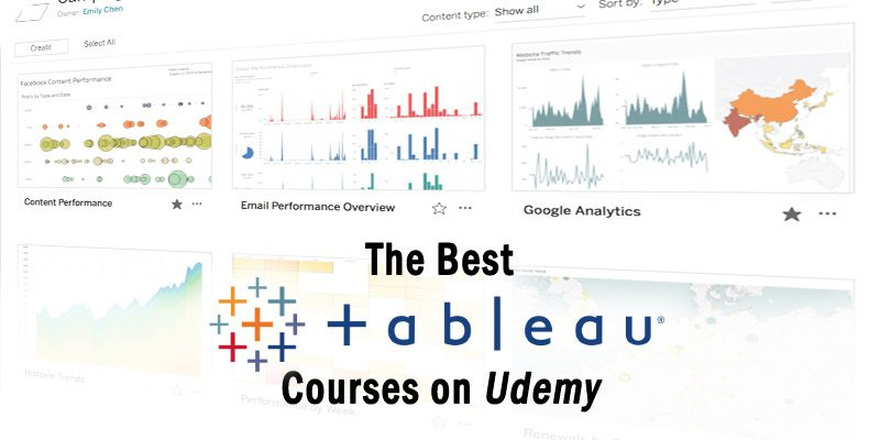
Tableau Training and Certification Courses is one of the best online Data Visualization Courses. With a growing emphasis on data and data-driven solutions, mastery of tools such as Tableau is becoming a must-have skill for anybody working in Big Data, Data Analytics, or Data Science. Udemy has a solid selection of Tableau courses to help you better comprehend, handle, and interpret data. These Tableau tutorials, which range from introductory courses for beginners to advanced courses for persons already working in the field of data visualization, can be obtained at a low cost to learn Tableau online at one's own pace and schedule.
Tableau training series by Kirill Eremenko (a highly regarded instructor with over 1.5 million students on Udemy) and SuperDataScience Team, which includes the following two courses, stands out among all Udemy Tableau courses.
- Tableau 2020 A-Z: Hands-On Tableau Training for Data Science
- Tableau 20 Advanced Training: Master Tableau in Data Science
These two Tableau courses have over 270000 students enrolled, with a 4.6 average rating and positive ratings. The course comprises approximately 18 hours of video content and focuses primarily on the Tableau tool rather than data visualization philosophy. Let's take a closer look at each of these courses.
Key Highlights
- Best courses to learn Tableau for Data Science
- Includes real-life data analytics exercises & quizzes
- Understand how Tableau is employed in the real world to solve actual business problems
- Learn to create bar charts, line charts, area charts, maps, scatter plots, treemaps, interactive dashboards and storylines
- Great fit for beginners or advanced professionals who want to gain right skills to leverage the full potential of Tableau
Duration : Self-Paced
Udemy Rating : 4.6/5.0
Enroll here: udemy.com/topic/tableau/
reddemy.com 
solutionsreview.com - Tableau 2020 A-Z: Hands-On Tableau Training for Data Science
-
Bokeh is a modern online browser-based interactive visualization library. This Python library is gaining popularity in the field of Data Science due to its capacity to build varied visualizations such as interactive charts, plots, dashboards, and complex data web applications fast and effectively.
This Udemy Data Visualization course is a comprehensive introduction to understanding Bokeh. It walks you through the process of utilizing Bokeh to build modern, interactive data visualizations in the web using only Python code (no JavaScript, HTML or CSS needed). The course begins with the fundamentals of Bokeh, charting simple datasets, then progresses to the development of sophisticated, interactive data visualization web apps that plot data in real time and alter dependent on user involvement. It discusses the following topics:- How to customize your plots by using the styling features that Bokeh offers
- How to add interactivity to your plots starting from popup windows and text boxes to drop down lists and user submited data
- How to add sliders to your plots to filter data
- How to create dynamic graphs that stream real-time data on the browser
- How to embed Bokeh apps in other web applications
- How to deploy Bokeh apps on web servers
There are several exercises included in the course to help learners check their skills as they progress. They get access to various data samples and are provided with additional examples to cement their Bokeh skills. Since, learners would be working on a Python library, and the course does not include any lectures on Python programming, it requires them to have a prior knowledge of Python.
Key Highlights
- Most popular Udemy course on Data Visualization with Python Bokeh
- Build advanced data visualization web apps using the Python Bokeh library
- Learn to create widgets that let users interact with your plots
- Learn how to troubleshoot Bokeh apps
- Learn to integrate and visualize data from Pandas DataFrames
- Understand how to integrate your data visualization apps with Flask apps
Duration : 6.5 hours on-demand video
Udemy Rating : 4.6/5.0
Enroll here: udemy.com/course/python-bokeh/

DigitalDefynd.com -
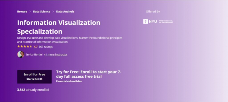
New York University offers this Information Visualization program through Coursera with the goal of providing learners with the necessary knowledge and practical skills to develop a strong foundation in information visualization and to design and develop advanced applications for visual data analysis. It is the graduate-level equivalent of the Information Visualization course taught at NYU Tandon School of Engineering. This specialization has no prerequisites and consists of four courses: foundations, applied perception, programming with D3.js, and advanced visualization approaches. The following subjects are covered in these courses:
- Overview of what visualization is and its scope and goals
- Recognizing type of information in data so that you can find appropriate visual representations
- Fundamental graphs such as bar charts, line charts and scatter plots
- Concept of visual encoding and decoding
- Fundamental concepts of visual perception applied to visualization design
- How to use D3.js to create powerful visualizations for web
- How to create choropleth and symbol maps, node-link diagrams and tree maps
- How to link two or more views through interaction
- How to visualize specific kinds of data (beyond tabular)
- Geographical, temporal and network visualization
- How to create highly interactive multiple-view visualizations
Exercises and practice assignments are included in all courses. Some projects call for students to create and build a full interactive visualization using real-world data sets. Three interviews are also featured, which provide students with direct experience tales from practitioners and researchers.
Key Highlights
- Opportunity to take a university level graduate course in visualization
- Provides a strong understanding of visual perception and visual encoding to enable learners to design and evaluate innovative visualization methods on their own
- Develop advanced web-based applications for visual data analysis
- Learn what designs are available for a given problem and what are their respective advantages and disadvantages
- Interviews with great researchers and practitioners in the field
- Hands-on projects that enable students to demonstrate mastery of the subject
Duration : 4 months, 3 hours per week
Coursera Rating : 4.6/5.0
Enroll here: coursera.org/specializations/information-visualization
coursera.org 
coursera.org -
Udacity's Data Visualization curriculum is a world-class, cutting-edge training program for developing data visualization and communication abilities. Udacity has worked with Tableau, the most popular data visualization tool, and an outstanding collection of industry professionals with considerable expertise to develop curriculum that focuses on the most in-demand skills. The curriculum teaches students how to produce clear and effective data visualizations and how to employ data-driven suggestions.
This Data Visualization certification program places a strong emphasis on developing storytelling abilities. Because stories are an effective way to engage audiences, make sense of data, and help businesses make better decisions, this program teaches students how to weave data into stories and visuals using a variety of tools and techniques. The program covers two data visualization platforms, Tableau and Flourish. The program comprises of four courses that cover the following topics:
- Introduction to Data Visualization
- How to select the most appropriate data visualization for an analysis
- How to create interactive and engaging Tableau dashboards
- Design and create a dashboard in an enterprise environment
- End to end process for Data Storytelling
- Advanced data visualization and storytelling techniques
- How to add interactivity and other visual elements to a story
- How to add animation and narration with Tableau Pages and Flourish
Throughout the program, students create a portfolio of high-quality projects to demonstrate their data visualization and storytelling talents. This program is ideal for those with a data background who want to maximize the effectiveness of their studies, as well as those with a business experience who want to encourage others to make more data-driven decisions. It needs students to have fundamental data analysis skills, such as spreadsheets and descriptive statistics.
Key Highlights
- Learn to combine the power of data analysis and storytelling to create impactful narratives with data
- Build interactive dashboards with Tableau
- Learn to incorporate advanced animation and narration into your stories
- Hands-on projects involving creating multiple types of Dashboards like Static Dashboard, Dynamic Dashboard, and
- Animated Dashboard
- Learn the Flourish Studio’s Talkie feature that allows you to add narrative audio to accompany your data story
- Access to a 1-on-1 technical mentor to answer questions, review work, and provide guidance
- Access to student community for network and support
- Access to a personal career coach and career services
Duration : 4 months, 5-10 hours per week
Google Rating : 4.6/5.0
Enroll here: udacity.com/course/data-visualization-nanodegree--nd197
mltut.com 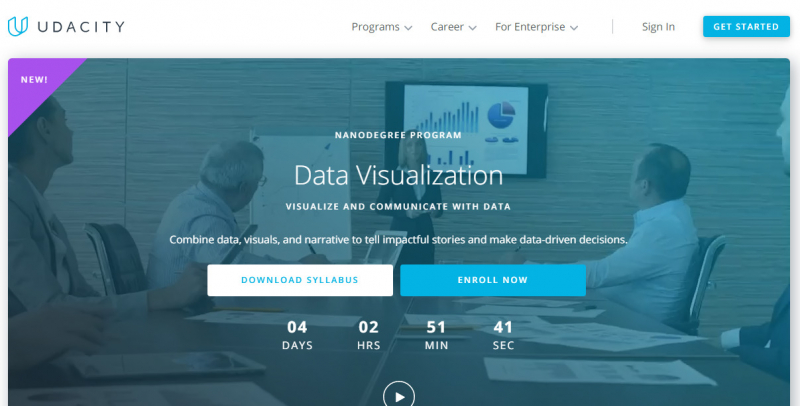
mltut.com -
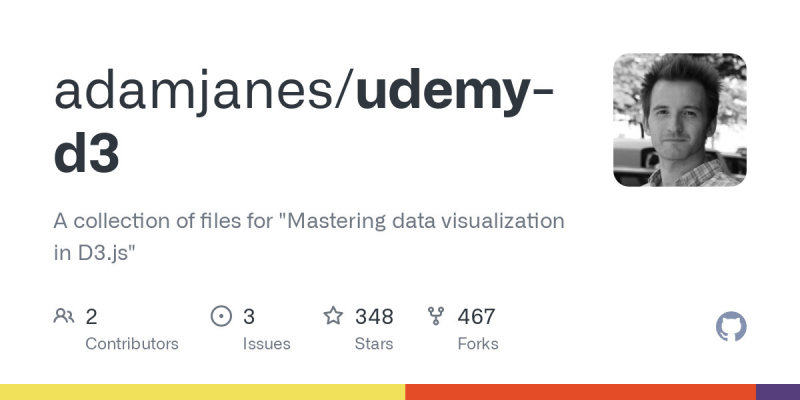
Mastering Data Visualization in D3.js is one of the best online Data Visualization Courses. D3.js is a JavaScript data visualization toolkit that may be used to create visually appealing charts, maps, flows, live and interactive graphs, and other data-driven representations. Adam Janes' Udemy Data Visualization course provides a thorough introduction to the D3.js toolkit and how to use it to design and build amazing data visualizations. It takes learners from complete D3 newcomers to being able to create any visualization they can think of. It not only teaches students how to build typical charts and graphs, but it also gives them the tools they need to construct any visualization on their own. This Data Visualization with D3.js course is structured into three parts:
- Part 1: Fundamentals of D3 – It covers the fundamentals of how D3 works. Learners are introduced to SVGs, data joins, scales and axes and how to create interactive visualizations by adding events to the page.
- Part 2: Visualization walkthroughs – It introduces learners to many types of visualizations and walks them through example code line-by-line.
- Part 3: Complex linked views – It teaches learners to create unified web apps where many visualizations on the page communicate with each other at the same time.
This is a hands-on course with four class projects (a bar chart, an updating bubble chart, an interactive line chart, and a data dashboard) that allow students to consolidate their knowledge and practice their skills with real-world data sets. This Data Visualization class is designed for students who have some web programming experience and want to learn about data visualization design and building complex interactive websites with D3js.
Key Highlights
- Best online course for Data Visualization in D3.js
- Understand the fundamental building blocks of D3
- Understand fundamental principles for design that help you to come up with unique visualizations of your own and articulate your design decisions to others
- Learn to choose the right visual channels for the data you’re working with to create unique visualizations
- Master advanced tools in D3, building choropleth maps, brushes, tooltips, and layouts
- Critique existing visualizations and invent better designs for displaying data
Duration : 7 hours on-demand video
Udemy Rating : 4.5/5.0
Enroll here: udemy.com/course/masteringd3js/
github.com 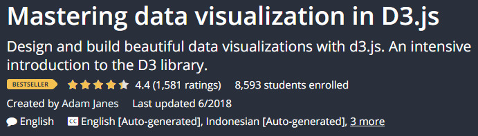
github.com -
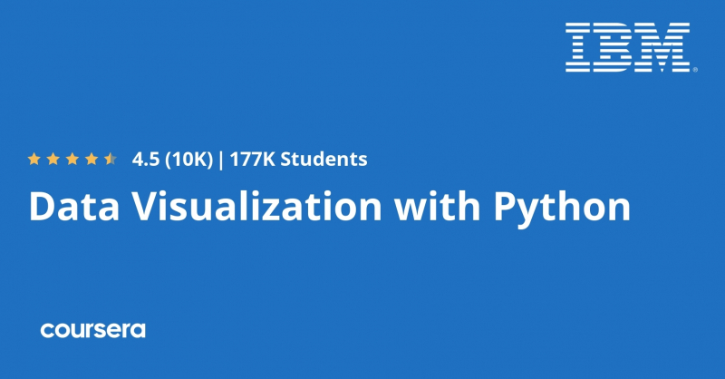
IBM designed this Data Visualization online course, which is available on Coursera. It is ranked among the top data visualization with Python courses, with over 85K students already registered. It teaches students how to use Python to visualize data in order to extract information, better understand the data, and make more informed judgments. It includes numerous Python data visualization tools, including Matplotlib, Seaborn, and Folium, which are used to visually present data. The course is divided into three weekly modules, each of which takes about 18 hours to complete. The following concepts are covered in these modules:
- Introduction to data visualization tools
- Basic plotting with Matplotlib
- How to read csv files into a pandas dataframe and process and manipulate the data in the dataframe
- How to generate line plots using Matplotlib
- Specialized Visualization Tools like area plots, histograms, bar charts, pie charts, box plots, scatter plots and bubble plots etc. and creating them with Matplotlib
- Advanced visualization tools such as waffle charts and word clouds and how to create them
- Visualization library Seaborn and how to use it to generate regression plots
- Geospatial data and visualizing it using Folium library
- How to create Choropleth maps
- How to use Folium to create maps of different regions of the world and superimpose markers on top of a map
After completing this data visualization training course, students will be able to present any seemingly meaningless data set in a way that others can understand and make sense of. It is aimed for intermediate users who have some expertise with Python and data management. This course is a component of IBM's Data Science specialties and professional certificate programs. This course will be applied to your learning in these programs if you complete it.
- IBM Data Science Professional Certificate
- IBM Applied Data Science Specialization
Key Highlights
- Learn the best techniques and methods to analyze and visualize data with Python programming
- Learn the data visualization libraries in Python – Matplotlib, Seaborn, and Folium
- Learn the best practices for creating plots and visuals
- Learn with real data sets and real world examples
- Multiple hands-on exercises, assignments and graded quizzes to apply the learning
- Course content is free to audit, with an option to pay a small fee for to access graded materials and verified certificate of completion
Duration : Approx. 18 hours
Google Rating : 4.5/5.0
Enroll here: coursera.org/learn/python-for-data-visualization
coursera.org -
This Tableau training for Data Visualization was created in conjunction with Tableau and is available through the Coursera platform. It is one of the best blends of theory and practice in Tableau, beginning with the core notions of data visualization and the different tools that Tableau has to offer and progressing through the creation of multi-frame data storytelling in Tableau. This data visualization training program makes use of Tableau's resource catalog to educate students best practices for data visualization and data storytelling. It consists of the five courses listed below:
- Fundamentals of Visualization with Tableau – This course introduces learners to data visualization and the Tableau interface. It also covers how to prepare and import data into Tableau.
- Essential Design Principles for Tableau – This course teaches how to analyze and apply essential design principles to your Tableau visualizations.
- Visual Analytics with Tableau – This course delves into the tools Tableau offers in the areas of charting, dates, table calculations and mapping.
- Creating Dashboards and Storytelling with Tableau – This course teaches how to create dashboards to identify the story within your data, and how to use Storypoints to create a powerful, impressive and effective story for your audience.
- Data Visualization with Tableau Project – This is a capstone project where learners are required to create a single-frame viz or multi-frame data story that is then shared on Tableau Public
This is a beginner level Data Visualization using Tableau certification program that is ideal for anyone who is familiar with data and datasets and wants to get started learning data visualization and tableau. This specialization does not require any prior technical or analytical knowledge.
Key Highlights
- Most popular Coursera Data Visualization certificate program
- Learn to use Tableau to create high-impact visualizations of common data analyses
- Learn to generate powerful reports and dashboards to help people make decisions and take action based on their business data
- Explain the relationship between data analytics and data visualization
- Examine the similarities and differences of exploratory and explanatory analysis
- Learn to apply predicative analytics to improve business decision making
- Understand how Tableau can use different types of geographic data, how to connect to multiple data sources and how to create custom maps
- Learn advanced functions within Tableau, such as hierarchies, actions and parameters to guide user interactions
- Learn with examples from real world business cases and journalistic examples from leading media companies
Duration : Approx. 6 months, 3 hours per week
Google Rating : 4.5/5.0
Enroll here: coursera.org/specializations/data-visualization

mltut.com 
codespaces.com -
The University of Illinois at Urbana-Champaign offers this Data Visualization course as part of their Data Mining Specialization. It teaches students in-depth concepts, methodologies, and applications of pattern recognition. It teaches about various visualization methods, how computer graphics is used to convey data, and how you observe and perceive data depending on how it is presented. The course is divided into four weeks, with each week requiring around four hours to complete the modules. The course covers the following topics:
- The Computer and the Human – It covers the basic concepts of data visualization is and how it’s used, different types of visualization and how humans perceive information.
- Visualization of Numerical Data – It covers assigning data to appropriate chart elements, using glyphs, parallel coordinates, and streamgraphs, as well as implementing principles of design and color to make visualizations more engaging and effective.
- Visualization of Non-Numerical Data – It covers how to visualize graphs that depict relationships between data items.
The Visualization Dashboard – It teaches learners to design their own visualization system for large datasets and dashboards.
Key Highlights
- Understand the general concepts of data mining along with basic methodologies and applications
- Learn to plot charts, glyphs and stacked charts
- Learn tree maps and graph visualization
- Learn principal component analysis and multidimensional scaling
- Learn to apply techniques from user-interface design to create an effective visualization system
Duration : 4 weeks, 2-4 hours per week
Coursera Rating : 4.5/5.0
Enroll here: coursera.org/learn/datavisualization
coursera.org 
coursera.org -
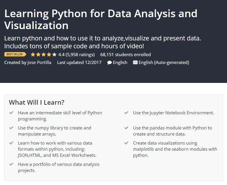
The course has over 21 hours of video content in 100+ lectures, sample python code notebooks, extra articles and reading materials, and various data analysis projects that learners can utilize for their portfolio. The course walks students through many Python data analysis libraries:
Jose Portilla designed this course, which is available on Udemy. The purpose of this course is to give students a thorough understanding of Python and how it can be used to successfully analyze and visualize data. This course will teach you NumPy, pandas, how to import and export data in Python, how to visualize data with Python tools, and how to create a data portfolio. It also mentions machine learning and Scikit-Learn. In addition to all of this, it includes appendix materials such as statistics, SQL with Python, and web scraping with Python. Students also learn to use SciPyto create distributions and solve statistical problems.
- NumPy – how to use Numpy to create and manipulate arrays with Python
- Pandas – how to use Pandas to create series, dataframes and do quick and effective analysis on data. Also covers Pandas built-in visualization tools
It also demonstrates how to create different visualizations for a wide range of data sets using following Python libraries:
- Matplotlib
- Seaborn
Key Highlights
- Excellent fit for learning how to program in Python and create Data Visualization with Python libraries
- Learn Data Analysis by Numpy and Pandas
- Learn how to use Python and Pandas to work with data in a variety of formats like JSON, HTML, text, csv and even Excel files
- Learn to create modern, impressive data visualizations using Matplotlib and Seaborn modules with python
- Learn to create a variety of charts, Bar charts, Line charts, Stacked charts, Pie charts, Histograms, KDE plots, Violin plots, Box plots, Regression plots, Scatter Plots, and Heatmaps
- Get access to over 100 example python code notebooks
- Build a portfolio of various data analysis projects
Duration : 21 hours on-demand video
Udemy Rating : 4.3/5.0
Enroll here: udemy.com/course/learning-python-for-data-analysis-and-visualization/
datasciencelearner.com