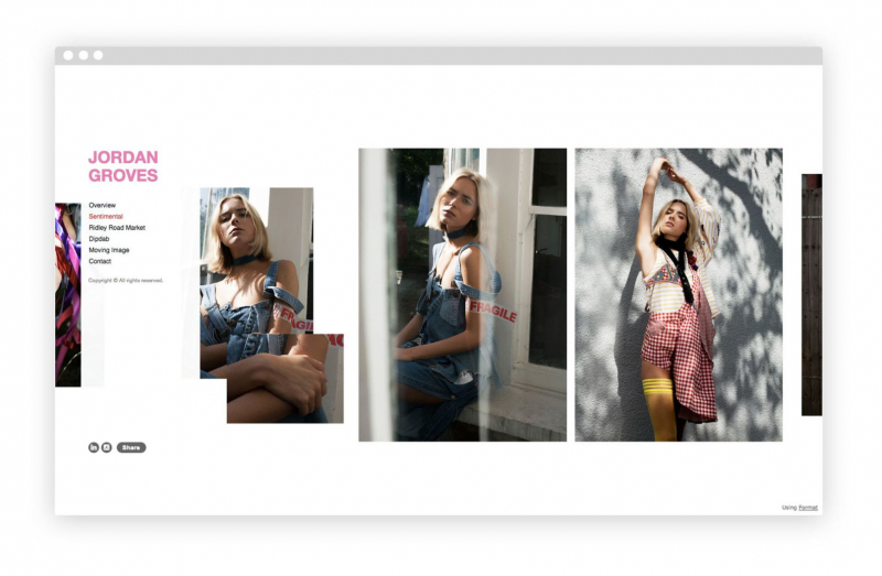
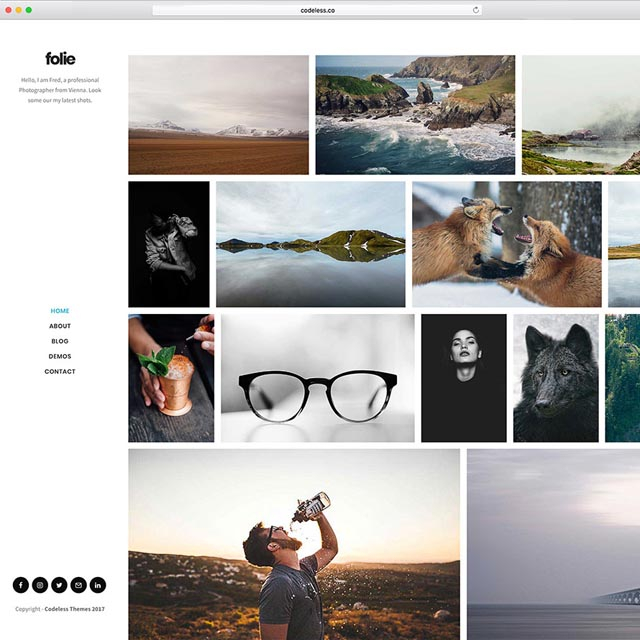
Keep Your Navigation Simple
In fact, the navigation menu is critical for the effectiveness of a photo website. Even though it only takes up a few pixels, it has the ability to make or break a website.
A good portfolio website must have a simple, easy-to-follow navigation menu. All of your galleries, your About page, and your contact information should be simply accessible without the need for drop-down menus. Keeping your portfolio site basic is the easiest method to keep your navigation simple. This should be no problem if you've limited yourself to just a few galleries, an About page, and a blog. On the other hand, if your navigation menu has more than 5-6 items, you might want to consider whether all of them are required.


