Top 10 Tips for Creating a Photography Portfolio Website
One of the quickest ways to attract more attention to your photos is to create a stunning portfolio website. It's critical to make your online portfolio the ... read more...best it can be, whether your objective is to sell prints online, attract new business, or showcase your work. Below are some Tips for Creating a Photography Portfolio Website that you can refer to!
-
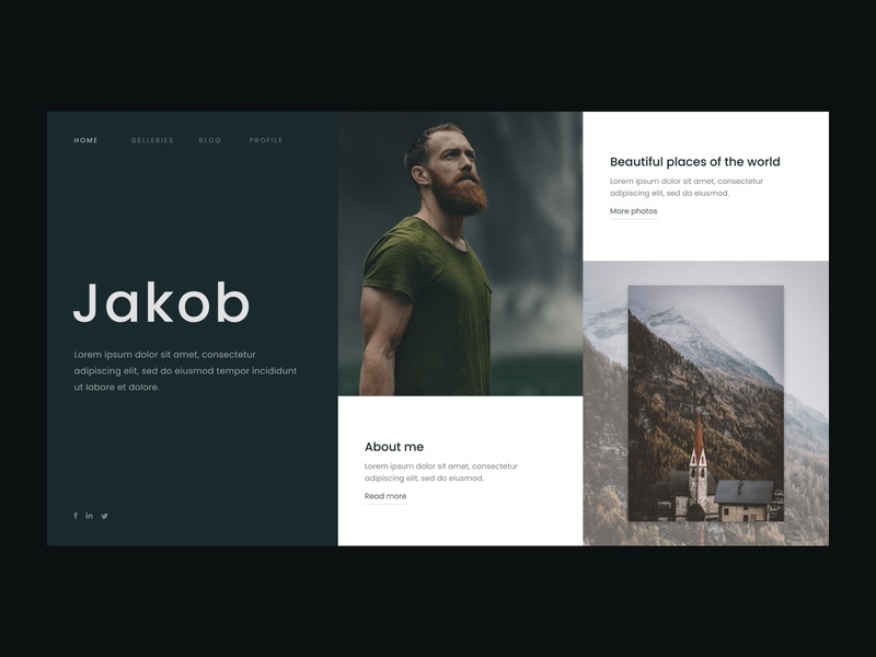
Making a strong first impression with your photography website is the most crucial thing you can do. Visitors should be immersed in your photographs from the moment they click on your website and want to see more.
To do so, you'll need a great homepage. Choose your best image, the one that makes people gasp when they see it and expand it to fill most or all of the screen when a new visitor arrives on your site. You may also use a slideshow or collage to show off the entire spectrum of your pictures if it covers numerous subjects or categories. Regardless of how you approach your site, it should draw the visitor's attention to your work. This is your best opportunity to impress them, so take advantage of it.
Make a Strong First Impression 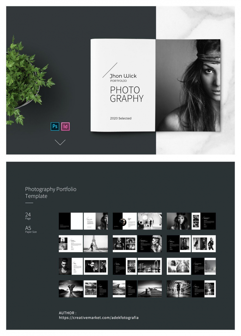
Make a Strong First Impression -
Your About page is one of the first places most people will go after looking at your photos. People want to know who's behind the camera, especially if they're thinking about buying a print or hiring you for a photoshoot.
Your About page should be just as much of a piece of artwork as your images. Describe who you are and why you do what you do to visitors. Don't be afraid to be quirky or creative. Even if they have nothing to do with your photography, including a few fun facts about yourself will help you connect with your visitors in a more personal way. Make sure to include a photo on the About page. It's critical to give visitors a chance to see your face if you want to engage with them.

Get Creative with Your About Page 
Get Creative with Your About Page -
Using your portfolio website as an online repository for your photography might be appealing. But don't buckle under the pressure!
Only your greatest work should be shown in your portfolio. Ideally, each gallery should have roughly 20-30 photographs, with no more than 2-3 galleries on the whole website. Adding more photographs than that will likely overwhelm your visitors, while what you actually want is for them to ask for more. It's a good idea to let others do the decision of selecting which photographs to feature on your site. Show friends and family a selection of 50-100 images and ask which ones they like. Friends and family are more likely to represent your site's visitors than you are, so you could be surprised at which images make the cut.
Include Your Best Photographs 
Include Your Best Photographs -
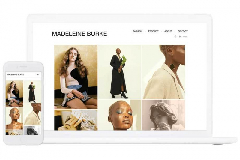
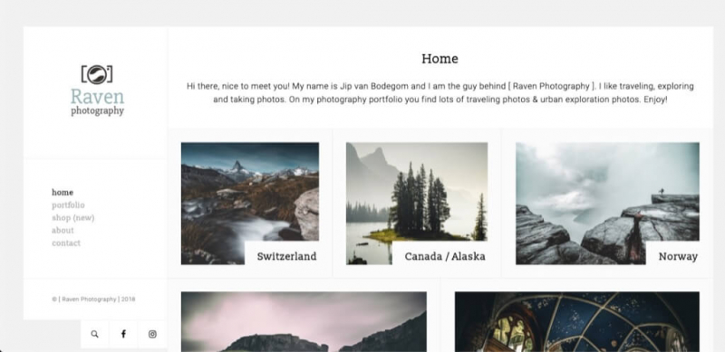
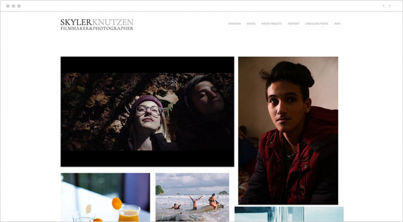
You may use a variety of approaches when it comes to creating your galleries. The best place to begin is by deciding how you want to organize your photos. Do you wish to make use of a grid? If that's the case, how many photographs should you put in each row? Do you want photographs to be spaced apart?
Looking through the portfolio templates in your website builder is a great method to get answers to these issues. There are many websites that features numerous themes for photographers, each of which displays your photographs in a slightly different approach. You may use one of these templates to quickly create a gallery or use them as inspiration for your own custom design.
Focus on Your Galleries 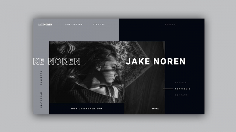
Focus on Your Galleries -
Every image has a backstory, which you may utilize to attract visitors to know more about your work. When someone discovers a photograph they like, having a caption that tells them more about it might mean the difference between making a print sale or not.
Most people are drawn to image captions to get a feel for the overall content. You may use captions to give your images a name, identify where they were taken, or provide behind-the-scenes information about how that image was created. Just remember to keep them short—if you want to share a longer story, you can use a blog post. Another advantage of adding captions to your photographs is that it improves the search engine optimization of your website (SEO).

Add Captions to Your Photos 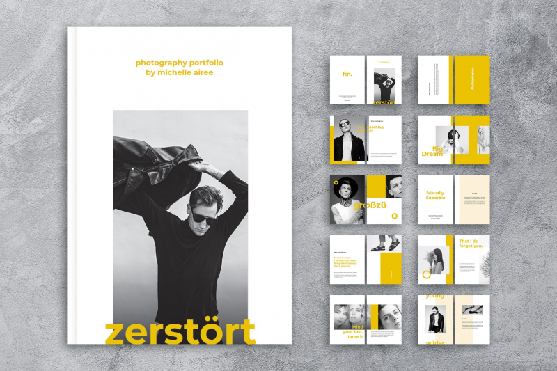
Add Captions to Your Photos -
Launching a blog is another excellent strategy to improve your portfolio website. A blog may be used to tell the full story behind a picture, describe a recent photoshoot, or even display photographs that didn't make it into your portfolio galleries.
Including a blog provides two key benefits. For starters, it's another way to interact with visitors. People who are interested in your photography may keep up with your latest work, discover more about your business, and learn more about their favorite photographs by following you on social media. Second, a blog may significantly improve your website's search engine optimization. Blog postings naturally include keywords related to your photography, which helps your website rank better for relevant search terms.
Add Captions to Your Photos 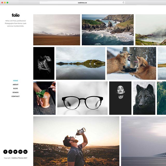
Add Captions to Your Photos -
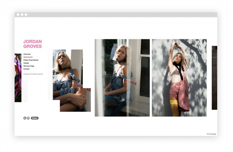
In fact, the navigation menu is critical for the effectiveness of a photo website. Even though it only takes up a few pixels, it has the ability to make or break a website.
A good portfolio website must have a simple, easy-to-follow navigation menu. All of your galleries, your About page, and your contact information should be simply accessible without the need for drop-down menus. Keeping your portfolio site basic is the easiest method to keep your navigation simple. This should be no problem if you've limited yourself to just a few galleries, an About page, and a blog. On the other hand, if your navigation menu has more than 5-6 items, you might want to consider whether all of them are required.
Keep Your Navigation Simple 
Keep Your Navigation Simple -
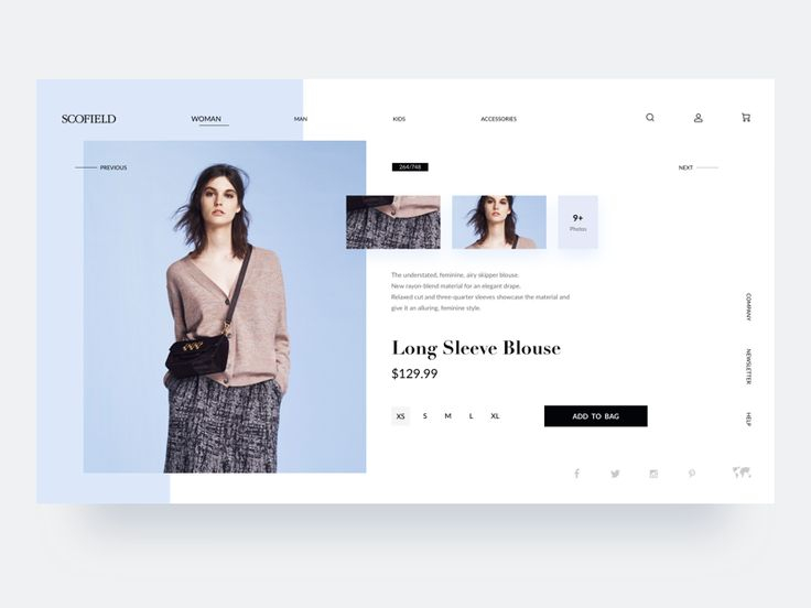
It's critical to be clear about what you offer if you're utilizing a portfolio website to sell prints or advertise your services. Include a page or section explaining how prints work, for example, if you sell prints. Explain what types of clients you deal with or what types of projects you accept if you offer photography services.
It also helps to be honest about prices. For print sales, you should have a uniform pricing list, and your prices should be easily accessible to visitors. Custom prints are great, but even visitors interested in one-of-a-kind prints would appreciate knowing your pricing range. In terms of services, quoting pricing in advance might be more difficult. Give a pricing range or a starting price for the services you advertise whenever possible.
Clearly Explain What You Offer 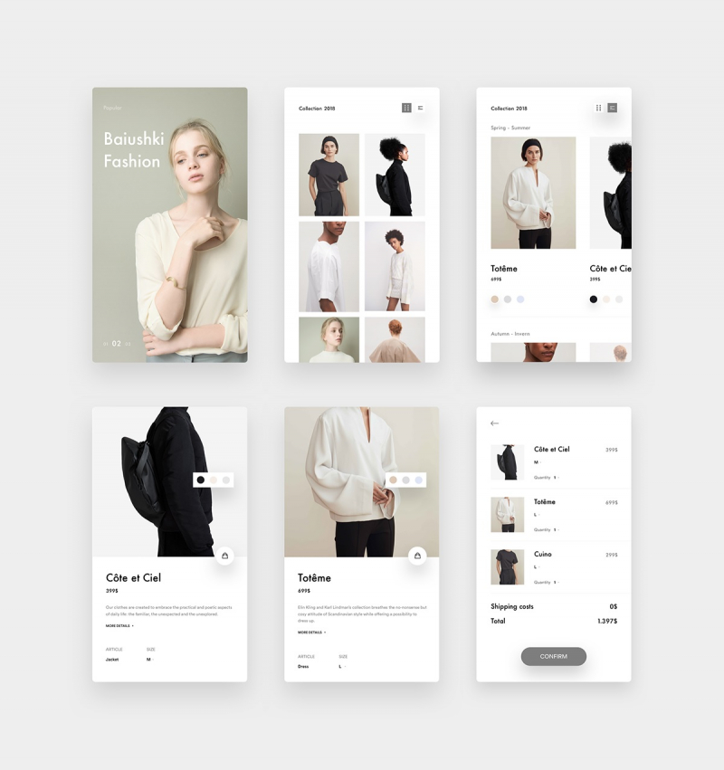
Clearly Explain What You Offer -
More than half of your site's visitors may be viewing your website on a smartphone or tablet these days. In 2020, over half of all online traffic came from mobile devices. As a result, you must consider how your site will look on smaller screens throughout the design process.
Most website designers provide mobile-responsive templates, which means the hard work of designing your site is done for you. Some website builders also allow you to directly customize your mobile site, which is a good idea. In any case, test your site on a smartphone throughout the design process to verify that all of the content you add looks well on any screen size.
Optimize for Mobile Viewing 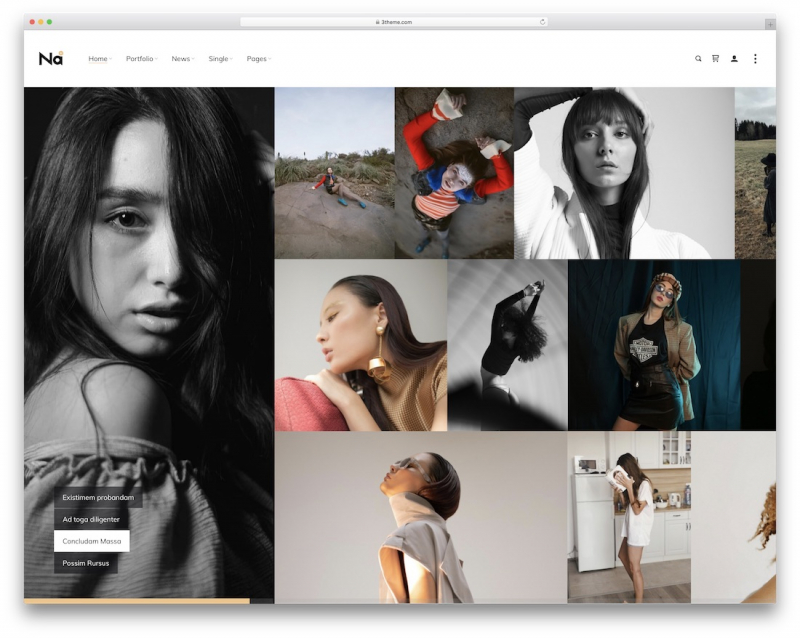
Optimize for Mobile Viewing -
Allow visitors to your site to share your content on Instagram and other social media platforms to demonstrate how social you are. Social media is the quickest and cheapest method to get your name out there and attract new clients, with over 500 million daily users on Instagram alone.
First, make sure a social bar with a link to all of your profiles is prominently displayed on your website. Your visitors should be able to find it in a few seconds on any page. The bar should be visible in your website's header, menu, or footer, or as an anchor on the side. Next, in the Pro Gallery, enable the sharing option. Nothing surpasses a striking photograph shared and liked on social media for enhancing one's reputation. Last but not least, remember to include the domain name of your website at the top of each of your social accounts to direct your social followers back to your professional website.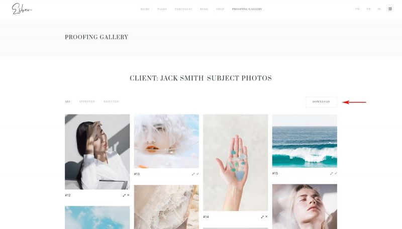
Connect to Your Social Channels 
Connect to Your Social Channels


