Python for Data Visualization: Matplotlib & Seaborn
Python for Data Visualization: Matplotlib & Seaborn ranks first in the list of the best online matplotlib courses. Many analytical tasks, such as data summarization, exploratory data analysis, and model output analysis, require data visualization. A good visualization is one of the simplest ways to communicate your findings to others. Fortunately, Python includes a plethora of libraries that provide useful tools for extracting insights from data. Matplotlib, the most well-known of these, allows users to create visualizations such as histograms, scatterplots, bar charts, pie charts, and many more.
Seaborn is yet another useful visualization library built on Matplotlib. It provides more aesthetically pleasing and statistically sophisticated data visualizations. Knowing how to use both of these libraries is critical for any data scientist or data analyst because they both provide simple methods for visualizing data for insight.
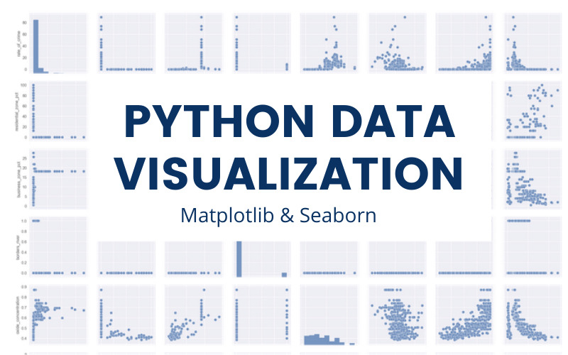
In this hands-on project, you will learn the fundamentals of Python data visualization and how to use two important Python libraries, Matplotlib and seaborn. You will learn how to create line plots, scatterplots, histograms, distribution plots, 3D plots, pie charts, pair plots, countplots, and many other types of plots. Please keep in mind that this course is best suited for students based in North America. They are currently working to replicate the experience in other regions.
What you will learn:
- Plot basic Line Plots
- Plot Scatterplot
- Plot pie charts
- Plot Histograms
- Plot Multiple Plots
- Plot Subplots
- Plot 3D Plots
- Plot Scatterplot & Count plot (Seaborn)
- Plot Pairplot, Distplot, and Heatmaps (Seaborn)
Coursera Rating: 4.6/5.0
Enroll here: https://www.coursera.org/projects/python-for-data-visualization-seaborn


