Top 10 Best Online Matplotlib Courses

Matplotlib is a comprehensive library for creating static, animated, and interactive visualizations in Python. Matplotlib makes easy things easy and hard ... read more...things possible. If you are lacking skills and need more knowledge about matplotlib, follow the list of the top 10 best online matplotlib courses.
-
Are you ready to embark on your journey to become a Data Scientist? KGP Talkie combines everything into one course. Learn about Data Visualization with real-world datasets. This comprehensive course will walk you through the process of learning how to leverage Python's power to analyze data and generate attractive visuals! This is a one-of-a-kind course in which you will study EDA on Kaggle's Boston Housing, Titanic and Latest Covid-19 Datasets, Text Dataset, IPL Cricket Matches from all seasons, and FIFA World Cup matches using real-world examples.
According to Indeed!, the average income of a data scientist in the United States and worldwide is over $110,000. Data Science is a rewarding profession that allows you to address some of the world's most intriguing problems! This course is intended for both novices with some programming expertise and experienced developers interested in transitioning to Data Science!
This thorough course is equivalent to other Data Science bootcamps, which typically cost thousands of dollars, but you can now study all of that stuff for a fraction of the price! This is one of the most complete courses on Complete Data Visualization in Python, with over 200+ Full HD video lessons and detailed code notebooks for each lecture. They'll show you how to program in Python, as well as how to analyze and generate stunning data visualizations in Python! This course can serve as a ready-to-use reference for your own project.
What you will learn:
- Learn Complete Exploratory Data Analysis on the Latest Covid-19 Dataset
- Learn EDA on Kaggle's Boston Housing and Titanic Datasets
- Learn IPL Cricket Matches and FIFA World Cup Matches Analysis and Visualization
- Learn Data Visualization by Plotly and Cufflinks, Seaborn, matplotlib, and Pandas
- Learn Interactive plots and visualizationInstallation of python and related libraries.
- Covid-19 Data VisualizationCovid-19 Dataset Analysis and Visualization in Python
- Data Science Visualization with Covid-19
- Use the Numpy and Pandas in data manipulation
- Learn Complete Text Data EDA
- Create a variety of charts, Bar Charts, Line Charts, Stacked Charts, Pie Charts, Histograms, KDE plots, Violinplots,
- Boxplots, Auto Correlation plots, Scatter Plots, Heatmaps
- Learn Data Analysis by Pandas.
- Use the Pandas module with Python to create and structure data.
Udemy Rating: 4.8/5.0
Enroll here: udemy.com/course/complete-data-visualization-in-python/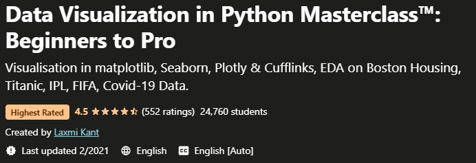
downloadly.net 
stoodnt.com -
Welcome to the greatest course on Pandas, Matplotlib, Seaborn, and more on the web! This course will help you improve your data abilities so that you may advance your career in Data Science, Machine Learning, Finance, Web Development, or any other tech-related sector. This is a well-structured course that covers a lot of ground, but it's all split down into manageable chunks rather than an overpowering reference manual that dumps everything at you at once. After each new lesson, you'll have the opportunity to put what you've learned into practice and challenge yourself with exercises and projects. They work with a variety of interesting and real-world information, such as Amazon bestsellers, Rivian stock prices, Presidential Tweets, Bitcoin historical data, and UFO sightings.
What distinguishes this course from others on the same subject? To begin with, this course incorporates visuals as early as feasible rather than in the conclusion, as many other courses do. Within the first few sections, you'll be generating your own plots! Furthermore, unlike most other courses, they begin with real datasets right away, rather than spending hours working with dull, fictitious data (colors, animals, etc.) before seeing your first real dataset.
What you will learn:
- Work with Jupyter Notebooks
- Use Pandas to read and manipulate datasets
- Work with DataFrames and Series objects
- Organize, filter, clean, aggregate, and analyze DataFrames
- Extract and manipulate date, time, and textual information from data
- Master Hierarchical Indexing
- Merge datasets together in Pandas
- Create complex visualizations with Matplotlib
- Use Seaborn to craft stunning and meaningful visualizations
- Create line, bar, box, scatter, pie, violin, rug, swarm, strip, and other plots!
Enroll here: udemy.com/course/python-data-analysis-visualization/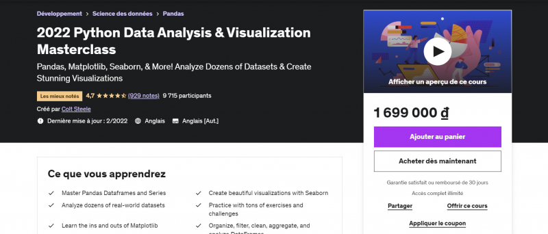
udemy.com 
udemy.com -
Welcome to the most comprehensive Data Science and Machine Learning course available online! This MasterClass was created to implement what appears to be the best route to go from zero to hero in Python Data Science and Machine Learning! This course is intended for people who are already familiar with Python and want to delve deeper into utilizing Python for Data Science and Machine Learning. A data scientist's usual beginning wage can easily exceed $100,000 per year, and they've built this course to help guide learners toward mastering a set of skills that will make them incredibly appealing in the world of data science. actual work
To give a clear and disciplined approach, they structured the course utilizing our experience of online (and face-to-face) teaching. This will teach you not only how to use prominent Data Science and Machine Learning libraries. This course strikes an ideal blend between real-world case studies and the mathematical theory underlying Machine Learning algorithms.
What you will learn:- Programming with Python
- NumPy with Python
- Complete Pandas learning for data analysis
- Full understanding of the Matplotlib programming library
- Seaborn Deep Learning for Data Visualizations
- Machine Learning with Scikit-Learn
Google Rating: 4.7/5.0
Enroll here: udemy.com/course/data-science-et-machine-learning-masterclass-python/
linkedin.com 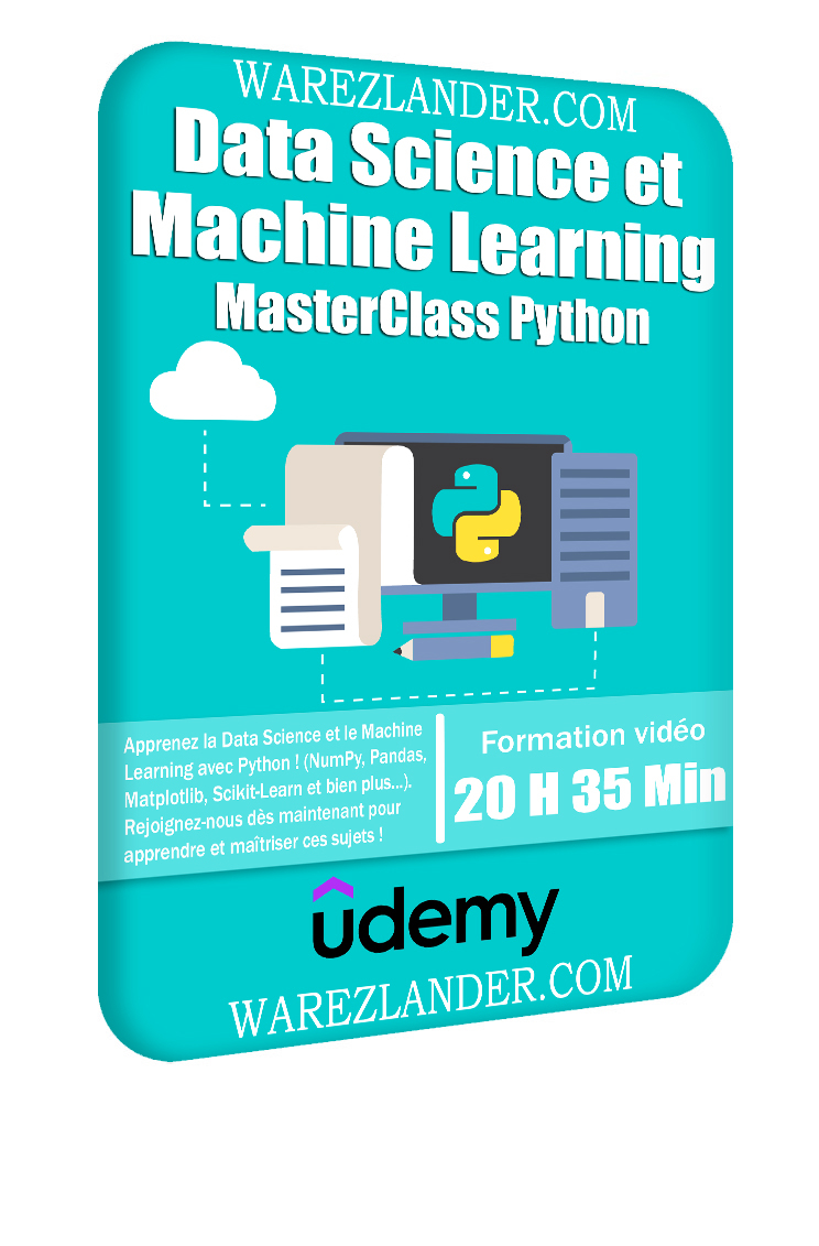
linkedin.com -
Python for Data Science and Machine Learning Bootcamp ranks 4th in the list of the best online matplotlib courses. This thorough course will teach you how to leverage Python's capabilities to analyze data, generate stunning visualizations, and employ sophisticated machine learning techniques! According to Indeed!, the average income of a data scientist in the United States is more than $120,000, making it the number one job on Glassdoor. Data Science is a rewarding profession that allows you to address some of the world's most intriguing problems!
This course is intended for both novices with some programming expertise and experienced developers interested in transitioning to Data Science! This thorough course is equivalent to other Data Science bootcamps, which typically cost thousands of dollars, but you can now study all of that stuff for a fraction of the price! This is one of the most comprehensive data science and machine learning courses on Udemy, with over 100 HD video lectures and complete code notebooks for each lecture!
What you will learn:- Use Python for Data Science and Machine Learning
- Use Spark for Big Data Analysis
- Implement Machine Learning Algorithms
- Learn to use NumPy for Numerical Data
- Learn to use Pandas for Data Analysis
- Learn to use Matplotlib for Python Plotting
- Learn to use Seaborn for statistical plots
- Use Plotly for interactive dynamic visualizations
- Use SciKit-Learn for Machine Learning Tasks
- K-Means Clustering
- Logistic Regression
- Linear Regression
- Random Forest and Decision Trees
- Natural Language Processing and Spam Filters
- Neural Networks
- Support Vector Machines
Google Rating: 4.6/5.0
Enroll here: udemy.com/course/python-for-data-science-and-machine-learning-bootcamp/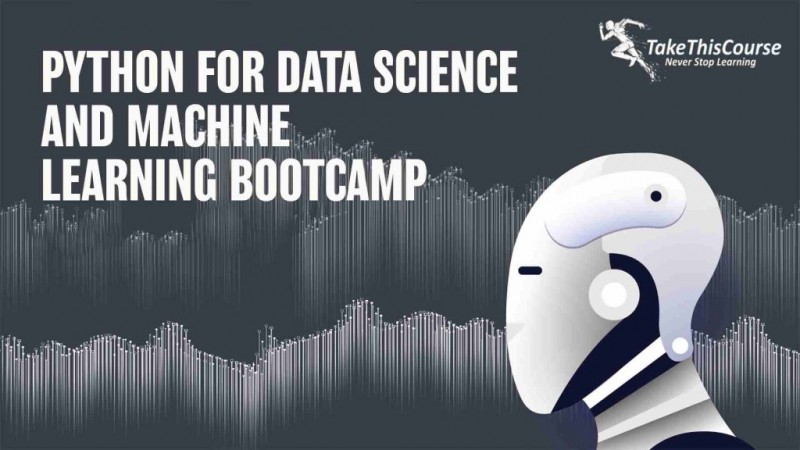
takethiscourse.net 
takethiscourse.net -
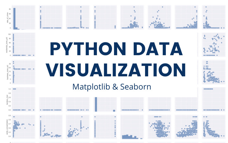
Python for Data Visualization: Matplotlib & Seaborn ranks first in the list of the best online matplotlib courses. Many analytical tasks, such as data summarization, exploratory data analysis, and model output analysis, require data visualization. A good visualization is one of the simplest ways to communicate your findings to others. Fortunately, Python includes a plethora of libraries that provide useful tools for extracting insights from data. Matplotlib, the most well-known of these, allows users to create visualizations such as histograms, scatterplots, bar charts, pie charts, and many more.
Seaborn is yet another useful visualization library built on Matplotlib. It provides more aesthetically pleasing and statistically sophisticated data visualizations. Knowing how to use both of these libraries is critical for any data scientist or data analyst because they both provide simple methods for visualizing data for insight.
In this hands-on project, you will learn the fundamentals of Python data visualization and how to use two important Python libraries, Matplotlib and seaborn. You will learn how to create line plots, scatterplots, histograms, distribution plots, 3D plots, pie charts, pair plots, countplots, and many other types of plots. Please keep in mind that this course is best suited for students based in North America. They are currently working to replicate the experience in other regions.
What you will learn:
- Plot basic Line Plots
- Plot Scatterplot
- Plot pie charts
- Plot Histograms
- Plot Multiple Plots
- Plot Subplots
- Plot 3D Plots
- Plot Scatterplot & Count plot (Seaborn)
- Plot Pairplot, Distplot, and Heatmaps (Seaborn)
Coursera Rating: 4.6/5.0
Enroll here: https://www.coursera.org/projects/python-for-data-visualization-seaborn
builtin.com 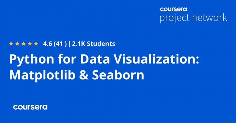
builtin.com -
This course focuses on Python programming as it applies to data science. If you want to learn to code, or if you want to learn to manipulate data, or both, this course is for you. This 8-hour course will first provide you with the tools you need to code in Python and do Data Science. Then he'll go on to the theoretical side of Python programming, with tasks at each stage to help him comprehend the theory by doing. Finally, you will learn how to properly modify and explore/visualize data.
You will be able to retrieve a data set that interests you and analyze it from A to Z to extract the information that interests you by the end of this course. This course is focused on Python because it is one of the most commonly used languages in data science. Furthermore, it is a language that you have mastered and that has shown to address all of data analysis problems. But it's also because it's a free, simple, and well-documented programming language.
What you will learn:
- Use Jupyter
- Programming in Python
- Collect data and integrate it into your work environment
- Know the different data structures (lists, dictionaries, tables, dataframes, ...)
- Efficiently manipulate data with Python and the Pandas library
- Explore and visualize data with Matplotlib and Seaborn
- Using Python to do data science
Google Rating: 4.6/5.0
Enroll here: udemy.com/course/data-science-avec-python/
learntocodewith.me 
learntocodewith.me -
The ability to tell a compelling story by visualizing data and findings in an approachable and stimulating manner is one of the most important skills of successful data scientists and data analysts. This course will teach you a variety of techniques for effectively visualizing both small and large-scale data. You will be able to take data that appears to have little meaning and present it in a way that conveys insights.
This course will teach you how to use many different Data Visualization tools and techniques. You'll learn how to make Waffle Charts, Area Plots, Histograms, Bar Charts, Pie Charts, Scatter Plots, Word Clouds, Choropleth Maps, and many more! You will also create interactive dashboards that will help even those with no Data Science experience understand data and make more effective and informed decisions.
You will learn by doing numerous labs and a final project that will allow you to practice and apply the various aspects and techniques of Data Visualization using Jupyter Notebooks and a Cloud-based IDE. In Python, you will use several data visualization libraries, including Matplotlib, Seaborn, Folium, Plotly, and Dash.What you will learn:
- Implement data visualization techniques and plots using Python libraries, such as Matplotlib, Seaborn, and Folium to tell a stimulating story
- Create different types of charts and plots such as line, area, histograms, bar, pie, box, scatter, and bubble
- Create advanced visualizations such as waffle charts, word clouds, regression plots, maps with markers, & choropleth maps
- Generate interactive dashboards containing scatter, line, bar, bubble, pie, and sunburst charts using the Dash framework and Plotly library
Google Rating: 4.5/5.0
Enroll here: coursera.org/learn/python-for-data-visualization
geeksforgeeks.org 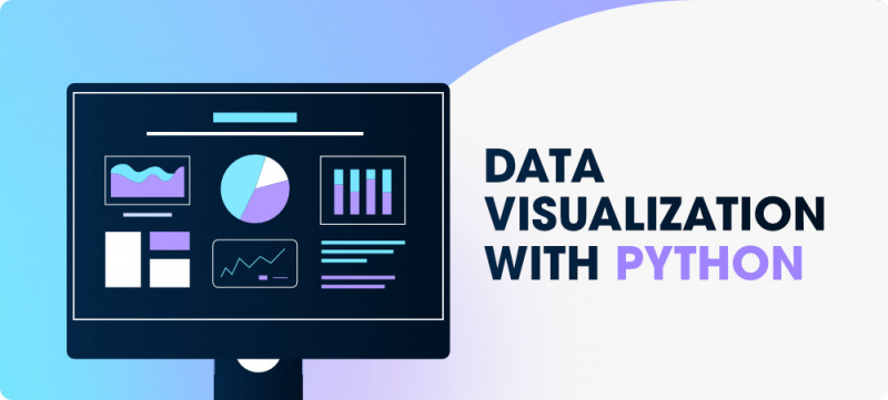
geeksforgeeks.org -
This course is intended for students with no prior coding experience, and it provides a crash course in Python that allows students to delve into core data analysis topics that can be transferred to other languages. This course will teach you how to import and organize data, how to use functions to gather descriptive statistics, and how to run statistical tests. This course is video-free to allow for a truly hands-on, self-paced learning experience.
Assignments include short explanations with images as well as runnable code examples with suggested edits to further explore code examples and gain a deeper understanding by doing. Along the way, you'll receive immediate feedback from a variety of assessment items, gradually progressing from quick understanding checks (multiple choice, fill in the blank, and un-scrambling code blocks) to small, approachable coding exercises that take minutes rather than hours. Finally, a longer-form lab at the end of the course will allow you to apply everything you've learned in a real-world context.
What you will learn:- Describe a numerical data set with statistics
- Import and describe a mixed data set using pandas and matplotlib
- Determine if populations are different using statistical tests
- Describe relationships between variables using statistical tests
Coursera Rating: 4.0/5.0
Enroll here: coursera.org/learn/codio-data-analysis-in-python-with-pandas-and-matplotlib-in-spyder
coursera.org 
coursera.org -
Data Visualizations with Python using Matplotlib ranks 4th in the list of the best online matplotlib courses. Python is a fabulous programming language that offers us many advantages when it comes to using it as a Data Viz tool. Nowadays, it is increasingly required that professionals acquire a significant level in terms of data visualizations, for the creation of graphs, dashboards, reports, that help a business to make better decisions with its data.
It is important to mention that this guided project has an "intermediate" difficulty for its development. The main objective at the end of all the knowledge capsules and associated practice deliveries is that students can learn the most relevant and important concepts to create data visualizations in Python, using the 3 most used libraries: Matplotlib, Seaborn and Plotly. You will also see how is the library installation process using the Anaconda Prompt. With the knowledge gained in this guided project, students will be able to create their own data visualizations, efficiently, effectively, and visually appealing to their audience.
What you will learn:
- Data Import and EDA
- Creating a Scatterplot chart
- Practice Activity: Customizing a Scatterplot
- Creating a Distplot Plot
- Practice Activity: Customizing a Distplot
- Creating a Barplot and Boxplot Chart
- Customizing a Boxplot and Violinplot
- Creating a Scatterplot with Plotly
- Capstone: Creating a Pie-Plot and Boxplot with Plotly
Coursera Rating: n/a
Enroll here: coursera.org/projects/visualizaciones-de-datos-con-python
neuraldojo.org 
coursera.org -
Without installing anything, you can code and run your first Python script with Matplotlib in minutes! This course is intended for students who have some Python experience and offers a crash course in Matplotlib. This allows students to delve into fundamental data visualization topics that can be transferred to other languages. This course will teach you how to use Jupyter to generate and select the best graphs to represent your data.
This course is video-free to allow for a truly hands-on, self-paced learning experience. Assignments include short explanations with images as well as runnable code examples with suggested edits to further explore code examples and gain a deeper understanding by doing. Along the way, you'll receive immediate feedback from a variety of assessment items, gradually progressing from quick understanding checks (multiple choice, fill in the blank, and un-scrambling code blocks) to small, approachable coding exercises that take minutes rather than hours.
What you will learn:
- Jupyter notebooks
- Create charts and plots
- Style and customize charts and plots
Enroll here: es.coursera.org/learn/select-topics-in-python-matplotlib
es.coursera.org 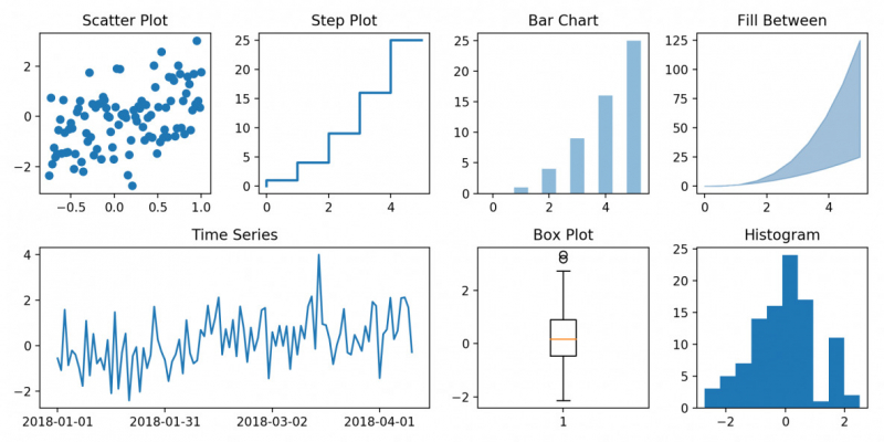
machinelearningplus.com