Top 12 Best Online Scientific Visualization Courses

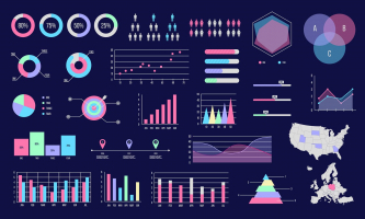
Data visualization is quickly becoming a talent that is absolutely essential to learn in this day and age of technology and big data. Organizations are ... read more...becoming more and more data-driven, so in addition to being able to read vast amounts of data, people also need to be able to analyze, decipher, digest, and compare complicated data in a way that is understandable to anybody who needs it. In all professions, including finance, marketing, technology, design, etc., there is a need for data communicators who can effectively visualize data and communicate results to both technical and non-technical people. Data visualization is not just limited to the field of data scientists and data analysts. Thus, to satisfy the burgeoning demand for online yet qualifying courses, Toplist has compiled a rundown of the Best Online Scientific Visualization Courses for those in need.
-
PricewaterhouseCoopers (PwC) developed this course, which is a component of their Data Analysis and Presentation Skills: the PwC Approach Specialization. The purpose of this course is to assist students in developing their analytical abilities by providing answers and illuminating a narrative using their facts. Excel is used to teach data visualization techniques since it is the most extensively used software program and is accessible to most students.
This Excel 2013 course on data visualization is jam-packed with practical instruction on sophisticated Excel 2013 features. It is divided into 4 weekly courses, each of which takes about 4 hours to finish. The following subjects are covered in these modules:
- Week 1: This week's focus is on connecting data and data models. It discusses relational database models' building blocks as well as the elements of data sets, and it demonstrates how to use PowerPivot in Excel to build databases and data models.
- Week 2: Learners will use data in this week's scenario and simulation analysis exercises. By utilizing some of Excel's built-in features, such as solver, data tables, scenario manager, and goal search, they will get the chance to put these skills into practice.
- Week 3: The modules this week are all about data visualization. The fundamentals are covered, along with the theory and ideas of data visualization. Also, demonstrate the creation of intricate graphs and charts to properly narrate your data.
- Week 4: In this week's lectures, the course will build complicated graphs and Power View reports using Excel, then talk about how to combine those with other elements to create dynamic dashboards using form controls, slicers, and conditional formatting.
At the end of each module, the course offers various practice activities and tests. The fact that this course has more than 65K students registered in it and has a respectable rating of 4.8 indicates how well-liked it is.
Key Highlights:
- Understand how to develop a data model using PowerPivot
- Understand the difference between effective and ineffective charting
- Learn to select the right type of chart to tell your data story
- Learn how to create column charts, combo charts, stacked column charts, heatmap, Gantt project plan, and power view reports
- Learn to create your own functional dashboard in Excel
Duration: 4 weeks, 4 hours per week
Rating: 4.8
Link: https://www.coursera.org/learn/advanced-excel
coursera.org 
coursera.org -
With the aim of providing students with the knowledge and practical skills needed to develop a solid foundation in information visualization as well as to design and develop advanced applications for visual data analysis, New York University is providing this information visualization program via Coursera. It is comparable to the graduate Information Visualization course offered by the Tandon School of Engineering at New York University.
This specialization comprises of four courses—foundations, applied perception, programming with D3.js, and advanced visualization techniques—and does not require any prior expertise. The following topics are covered in these courses:
- Overview of what visualization is and its scope and goals
- Recognizing type of information in data so that you can find appropriate visual representations
- Fundamental graphs such as bar charts, line charts and scatter plots
- Concept of visual encoding and decoding
- Fundamental concepts of visual perception applied to visualization design
- How to use D3.js to create powerful visualizations for web
- How to create choropleth and symbol maps, node-link diagrams and tree maps
- How to link two or more views through interaction
- How to visualize specific kinds of data (beyond tabular)
- Geographical, temporal and network visualization
- How to create highly interactive multiple-view visualizations
Exercises and practice assignments are part of every course. For some assignments, students must plan and create a comprehensive interactive display using sets of real-world data. Three interviews are also featured, giving students the chance to learn from the first-hand accounts of practitioners and researchers.
Key Highlights:
- Opportunity to take a university level graduate course in visualization
- Provides a strong understanding of visual perception and visual encoding to enable learners to design and evaluate innovative visualization methods on their own
- Develop advanced web-based applications for visual data analysis
- Learn what designs are available for a given problem and what are their respective advantages and disadvantages
- Interviews with great researchers and practitioners in the field
- Hands-on projects that enable students to demonstrate mastery of the subject
Duration: 4 months, 3 hours per week
Rating: 4.7
Link: https://www.coursera.org/specializations/information-visualization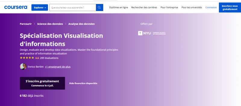
coursera.org 
coursera.org -
The Excel to MySQL: Analytic Techniques for Business Specialization at Duke University includes a course on data visualization using Tableau. The purpose of this course is to prepare students to become experts at expressing the practical consequences of their data analytics that have an impact on business. It trains them to utilize Tableau to communicate important findings and to streamline their study by posing the correct questions. Students study storyboarding techniques and learn how to use Tableau to depict the outcomes of data analysis or machine learning models so that both technical and non-technical stakeholders can more easily understand them.
The most used visualization tool on the market is Tableau. This course looks at many Tableau capabilities that may be used to produce powerful visualizations that state results succinctly and clearly. The course should take about 25 hours to finish if spread out across 5 weeks. It includes a culminating project that is evaluated by peers to gauge how well students have learned the material. The course covers the following topics:
- Creating graphs that are used in business analysis
- Transforming data in Tableau
- Designing business dashboards with Tableau
- Creating and delivering compelling business presentations
- How to craft the right questions to ensure your analysis projects succeed
- Writing calculations and equations in Tableau
- Adapting visualizations to make them maximally communicative
Key Highlights:
- Understand how to structure your data analysis projects to ensure that they lead to actionable advice that can be presented to stakeholders
- Learn to communicate the results and implications of your quantitative analyses visually in a way that non-technical people can understand
- Publish online business dashboards with Tableau
- Learn a set of tools and concepts that you can use to optimize your visualizations and your presentation style
- Series of practice exercises that involves doing analyses on a sample data set
Duration: Approx. 25 hours
Rating: 4.7
Link: https://www.coursera.org/learn/analytics-tableau
coursera.org 
coursera.org -
The University of California and Tableau collaborated to create this Tableau training for Data Visualization, which is now being made available through the Coursera platform, and is one of the Best Online Scientific Visualization Courses. One of the best ways to learn Tableau is through a course that starts with the fundamentals of data visualization, introduces a variety of Tableau tools, and progresses from there to the creation of multi-frame data stories.
The best practices for data visualization and data storytelling are taught to learners through this data visualization training program, which makes use of Tableau's resource catalog. It consists of the five following courses:
- Fundamentals of Visualization with Tableau – This course introduces learners to data visualization and the Tableau interface. It also covers how to prepare and import data into Tableau.
- Essential Design Principles for Tableau – This course teaches how to analyze and apply essential design principles to your Tableau visualizations.
- Visual Analytics with Tableau – This course delves into the tools Tableau offers in the areas of charting, dates, table calculations and mapping.
- Creating Dashboards and Storytelling with Tableau – This course teaches how to create dashboards to identify the story within your data, and how to use Storypoints to create a powerful, impressive and effective story for your audience.
- Data Visualization with Tableau Project – This is a capstone project where learners are required to create a single-frame viz or multi-frame data story that is then shared on Tableau Public.
Anyone who is familiar dealing with data and datasets and wants to start learning data visualization using Tableau is a great candidate for this entry-level data visualization using Tableau certification program. Enrollment in this specialization does not require any prior technical or analytical training.
Key Highlights:
- The most popular certificate program for data visualization on Coursera
- Discover how to use Tableau to produce powerful visuals of typical data analyses.
- Learn to create effective dashboards and reports so that employees can use their business data to make decisions and take action.
- Describe how data analytics and data visualization are related.
- Examine how exploratory and explanatory analysis differ and are comparable.
- Learn how to use predictive analytics to make better business decisions.
- Recognize the many geographic data formats that Tableau can use, how to connect to different data sources, and how to make custom maps.
- Learn more complex Tableau features, including as hierarchies, actions, and parameters, to help direct user interactions.
- Learn by using examples from actual business situations and journalism from top media outlets.
Duration : Approx. 6 months, 3 hours per week
Rating : 4.6
Link: https://www.coursera.org/specializations/data-visualization
coursera.org 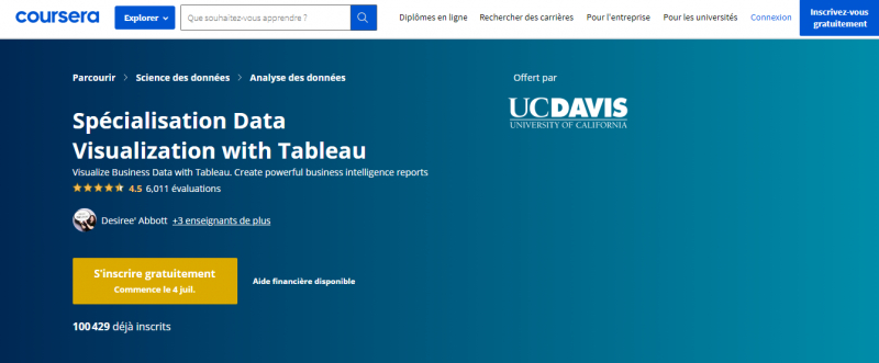
coursera.org -
The IBM-developed online course on data visualization is accessible on Coursera. Over 85K students have already enrolled in it, making it one of the best Python courses for data visualization. It teaches students how to use Python to visualize data to extract information, comprehend the data better, and come to more informed judgments. It includes a number of Python data visualization tools, including Matplotlib, Seaborn, and Folium, which are used to portray the data visually.
The three weekly modules of the course take about 18 hours of work to complete in total. The following concepts are covered in these modules:
- Introduction to data visualization tools
- Basic plotting with Matplotlib
- How to read CSV files into a pandas data frame and process and manipulate the data in the data frame
- How to generate line plots using Matplotlib
- Specialized Visualization Tools like area plots, histograms, bar charts, pie charts, box plots, scatter plots and bubble plots etc., and creating them with Matplotlib
- Advanced visualization tools such as waffle charts and word clouds and how to create them
- Visualization library Seaborn and how to use it to generate regression plots
- Geospatial data and visualizing it using Folium library
- How to create Choropleth maps
- How to use Folium to create maps of different regions of the world and superimpose markers on top of a map
After completing this data visualization training course, students will be able to present any seemingly meaningless data collection in a way that is easy for others to understand and understand. It is designed for intermediate users with Python and data handling knowledge. This course is a component of the IBM professional certificate programs and related Data Science specializations. Your learning from these programs will be credited once you have finished this course.
Key Highlights:
- Learn the best techniques and methods to analyze and visualize data with Python programming
- Learn the data visualization libraries in Python – Matplotlib, Seaborn, and Folium
- Learn the best practices for creating plots and visuals
- Learn with real data sets and real-world examples
- Multiple hands-on exercises, assignments, and graded quizzes to apply the learning
- Course content is free to audit, with an option to pay a small fee to access graded materials and verified certificate of completion
Duration: Approx. 18 hours
Rating: 4.6
Link: https://www.coursera.org/learn/python-for-data-visualization
coursera.org -
Tableau is a highly effective data analytics and visualization tool. Anyone working in big data, data analytics, or data science should be familiar with tools like Tableau given the growing emphasis on data and data-driven technology. A good selection of Tableau courses are available on Udemy, which will help you better comprehend, manage, and analyse data. These Tableau tutorials can be accessed for a low cost to learn Tableau online at one's own pace and schedule. They range from introductory courses suitable for beginners to advanced courses for professionals already working in the field of data visualization. One of the best online scientific visualization courses is Tableau Training and Certification Courses (Udemy).
Among all Udemy Tableau classes, the Tableau training series by Kirill Eremenko and the SuperDataScience Team, which consists of the following two courses, is particularly remarkable. Kirill Eremenko is a highly recognized instructor with roughly 1.5 million Udemy students.
- Tableau 2020 A-Z: Hands-On Tableau Training for Data Science
- Tableau 20 Advanced Training: Master Tableau in Data Science
More than 270000 students are enrolled in these two Tableau courses together, and they have received positive evaluations and an average rating of 4.6. More than 18 hours of video are included in the series, which mostly covers the Tableau tool rather than data visualization philosophy. Let's take a closer look at each of these courses.
Key Highlights:
- Best courses to learn Tableau for Data Science
- Includes real-life data analytics exercises & quizzes
- Understand how Tableau is employed in the real world to solve actual business problems
- Learn to create bar charts, line charts, area charts, maps, scatter plots, treemaps, interactive dashboards and storylines
- Great fit for beginners or advanced professionals who want to gain right skills to leverage the full potential of Tableau
Duration : Self-Paced
Rating : 4.6
Link: https://www.udemy.com/topic/tableau/
udemy.com 
udemy.com -
This Udacity data visualization curriculum is a top-notch, cutting-edge training course to improve communication and data visualization abilities, which is one of the best online scientific visualization courses. To develop a curriculum that focuses on the most in-demand skills, Udacity worked with Tableau, the most popular data visualization tool, and a fantastic team of industry veterans with considerable expertise. The course equips participants with the skills necessary to produce compelling data visualizations and leverage their analysis to provide data-driven recommendations.
The development of narrative abilities is a major focus of this Data Visualization certification program. This curriculum teaches students how to incorporate data into stories and visualizations using a variety of tools and methodologies because tales provide a potent means to engage the audience, make sense of the data, and aid organizations in making better decisions.
The program comprises four courses that cover the following topics:
- Introduction to Data Visualization
- How to select the most appropriate data visualization for an analysis
- How to create interactive and engaging Tableau dashboards
- Design and create a dashboard in an enterprise environment
- End to end process for Data Storytelling
- Advanced data visualization and storytelling techniques
- How to add interactivity and other visual elements to a story
- How to add animation and narration with Tableau Pages and Flourish
Students create a portfolio of excellent projects throughout the course of the program to demonstrate the data visualization and narrative abilities they acquire. This program is a great fit for those with a background in data who want to maximize the effect of their analysis or for those with a background in business who want to influence others to make decisions based more on data. Students must possess the fundamentals of data analysis, including knowledge of spreadsheets and descriptive statistics.
Key Highlights:
- Learn to combine the power of data analysis and storytelling to create impactful narratives with data
- Build interactive dashboards with Tableau
- Learn to incorporate advanced animation and narration into your stories
- Hands-on projects involve creating multiple types of Dashboards like Static Dashboard, Dynamic Dashboard, and Animated Dashboard
- Learn the Flourish Studio’s Talkie feature that allows you to add narrative audio to accompany your data story
- Access to a 1-on-1 technical mentor to answer questions, review work and provide guidance
- Access to the student community for network and support
- Access to a personal career coach and career services
Duration: 4 months, 5-10 hours per week
Rating: 4.6
Link: https://www.udacity.com/course/data-visualization-nanodegree

udacity.com 
udacity.com -
A range of Data Visualization training courses and tutorials are available through LinkedIn Learning, which can assist students in staying current. These courses, which teach the ideal combination of skills to combine the power of data and visuals, have been developed by experts and industry professionals with years of experience. These assist students in building a strong basis for how to approach the interpretation and delivery of data and data insights visually. These resources are divided into groups based on prerequisites and the degree of difficulty. Beginners can enroll in introductory courses before moving on to more advanced and advanced courses. All of these are available for free as part of the signup's 30-day free trial.
Some popular choices of data visualization courses on LinkedIn Learning include:
- Tableau Essential TrainingBy: Curt FryeDuration: 4h 30mIn this course you will learn to analyze and display data using Tableau Desktop 2019—and make better, more data-driven decisions for your company. Also learn how to create and manipulate data visualizations—including highlight tables, charts, scatter plots, histograms, maps, and dashboards—and how to share your visualizations.
- Data Dashboards in Power BIBy: Helen WallDuration: 4h 52mThis course focuses on the front end of the Power BI application—the dashboard—where users interact with charts and graphs that communicate trends in their data. It teaches how to work with data from open-source websites, create visuals such as heatmaps and sparklines, compare multiple variables with trendlines and violin plots, and build engaging maps.
- Creating Interactive Tableau DashboardsBy: Matt FrancisDuration: 3h 28mIn this course you will learn how to create compelling, informative, and eye-catching dashboards using Tableau.
- Data Visualization: StorytellingBy: Bill ShanderDuration: 1h 37mThis course teaches how to think about, and craft, stories from data by examining many compelling stories in detail.
Key Highlights:
- Master data visualization tools and techniques
- Learn how to communicate the story that data findings represent
- Discover how to select the right graphic for the right context
- Courses created and led by industry experts
Duration: Self-Paced
Rating: 4.5
Link: https://www.linkedin.com/learning/topics/data-visualization
linkedin.com 
linkedin.com -
The University of Illinois at Urbana-Data-Champaign's Mining Specialization is one of the best online scientific visualization courses and offering this course on data visualization. It instructs the students in the intricate ideas, procedures, and applications of pattern recognition. It teaches various visualization techniques, how data is presented using computer graphics, and how the perception of data changes depending on how it is displayed.
The course is divided into 4 weeks, with each week's modules taking about 4 hours to complete. The course covers the following subjects:
- The Computer and the Human - This section discusses the fundamentals of data visualization, including what it is, how it is used, the various forms of visualization, and how people interpret data.
- Visualization of Numerical Data - This topic discusses how to allocate data to the right chart elements, use glyphs, parallel coordinates, and streamgraphs, as well as how to apply design and color principles to make visualizations more appealing and useful.
- Visualization of Non-Numerical Data - This topic discusses ways to display graphs that show connections between different data points.
- The Visualization Dashboard teaches students how to create their own dashboards and huge dataset visualization systems.
Key Highlights:
- Understand the general concepts of data mining along with basic methodologies and applications
- Learn to plot charts, glyphs, and stacked charts
- Learn tree maps and graph visualization
- Learn principal component analysis and multidimensional scaling
- Learn to apply techniques from user-interface design to create an effective visualization system
Duration : 4 weeks, 2-4 hours per week
Rating : 4.5
Link: https://www.coursera.org/learn/datavisualization
coursera.org 
coursera.org -
In collaboration with leading universities and international organizations, edX provides free Data Visualization training courses and programs to develop the most in-demand skills in this area. These include individual courses, Micromasters programs, and professional certificates. These can be enrolled in for free, however, depending on the program or course, there may be a price to access graded assignments and projects and to obtain a certificate of completion to demonstrate the learned abilities.
The majority of courses are self-paced, allowing students to begin at any time and finish them at their own leisure. These programs are highly appealing to individuals who wish to advance their abilities while keeping full-time work because of the flexibility of the timetables.
Students can enroll in edX courses on data visualization to study the fundamentals of the field, how to analyze data using a variety of tools and programs, and how to mix data with graphics to produce compelling presentations that support solid business decisions.
Some of the top data visualization courses on edX include:
- Data Science: Visualization by Harvard University
- Visualizing Data with Python by IBM
- MATLAB and Octave for Beginners by EPFL
- Analyzing and Visualizing Data with Power BI by Davidson College
- Data Analytics and Visualization in Health Care by Rochester Institute of Technology
- Data Visualization for All by Trinity College
Key Highlights:
- Become confident in working with data, creating data visualizations, and preparing reports and dashboards
- Learn to tell your story with interactive charts and maps on the web
- Learn data visualization best practices
- Complete flexibility to learn on your own time and pace
Duration: Self-Paced
Rating: 4.5
Link: https://www.edx.org/search?q=data+visualization
edx.org 
edx.org -
The JavaScript data visualization toolkit D3.js is particularly effective at producing visually appealing graphs, maps, flows, live charts, and other data-driven representations, that is one of the best online scientific visualization courses. Adam Janes' Udemy course on data visualization gives a thorough introduction to the D3.js framework and shows you how to use it to plan and design eye-catching data representations. It takes students from being total D3 newbies to being able to create any graphic they can think of. It not only teaches students how to make basic graphs and charts, but also gives them the skills they need to master any visualization on their own.
There are three sections to this Data Visualization with D3.js course:
- Part 1: D3 Foundations. Students learn about SVGs, data joins, scales, and axes, as well as how to build interactive visualizations by including events on the page.
- Part 2: Visualization Walkthroughs - This section takes students line-by-line through an example of code while introducing them to several sorts of visualizations.
- Part 3: Complex connected views - This section teaches students how to build unified web applications that allow many visualizations to converse with each other simultaneously.
This is a very hands-on course with four class projects that let students consolidate their learning and practice their skills with actual data sets. The projects include a bar chart, an updated bubble chart, an interactive line chart, and a data dashboard. This data visualization course is designed for students who have some prior web programming knowledge and want to learn how to construct complex interactive websites using D3js.
Key Highlights:
- Best online course for Data Visualization in D3.js
- Understand the fundamental building blocks of D3
- Understand fundamental principles for design that help you to come up with unique visualizations of your own and articulate your design decisions to others
- Learn to choose the right visual channels for the data you’re working with to create unique visualizations
- Master advanced tools in D3, building choropleth maps, brushes, tooltips, and layouts
- Critique existing visualizations and invent better designs for displaying data
Duration: 7 hours on-demand video
Rating: 4.4
Link: https://www.udemy.com/course/masteringd3js/
udemy.com 
udemy.com -
Jose Portilla is the author of this course, which is offered on Udemy. This course's objective is to give students a thorough understanding of Python and how to utilize it efficiently for data analysis and visualization. The topics covered in this course include NumPy, pandas, data import and export in Python, data visualization using Python tools, and data portfolio projects. Additionally, Scikit-machine Learn's learning is mentioned. In addition to all of this, it includes appendix materials that cover topics like statistics, using SQL with Python and web scraping.
More than 100 lectures totaling more than 21 hours of video footage, for example Python code notebooks, supplementary articles and reading materials, and a number of data analysis projects that students can utilize for their portfolios are all included in the course.
The course guides learners through several data analysis libraries in Python:
- NumPy – how to use Numpy to create and manipulate arrays with Python
- Pandas – how to use Pandas to create series, dataframes and do quick and effective analysis on data. Also covers Pandas built-in visualization tools
It also demonstrates how to create different visualizations for a wide range of data sets using following Python libraries:
- Matplotlib
- Seaborn
- Students also learn to use SciPyto create distributions and solve statistical problems.
Key Highlights:
- Excellent fit for learning how to program in Python and create Data Visualization with Python libraries
- Learn Data Analysis by Numpy and Pandas
- Learn how to use Python and Pandas to work with data in a variety of formats like JSON, HTML, text, csv and even Excel files
- Learn to create modern, impressive data visualizations using Matplotlib and Seaborn modules with python
- Learn to create a variety of charts, Bar charts, Line charts, Stacked charts, Pie charts, Histograms, KDE plots, Violin plots, Box plots, Regression plots, Scatter Plots, and Heatmaps
- Get access to over 100 example python code notebooks
- Build a portfolio of various data analysis projects
Duration : 21 hours on-demand video
Rating : 4.3
Link: https://www.udemy.com/course/learning-python-for-data-analysis-and-visualization/
udemy.com 
udemy.com