Top 10 Tips for Creating a Good Logo for Your Business

A logo serves as an advertisement, showing your brand's objective and statement to potential customers while helping in maintaining your company's recognition. ... read more...As a result, developing a strong logo design to represent and advertise your company is important. Read on for some suggestions for creating a logo that will make your company stand out if you're not sure where to begin with the creative design process.
-
If you're interested in web design, it's important to know the different web design tools available to you. Knowing these tools can help you grow your skills in this profession and help you impress hiring managers.
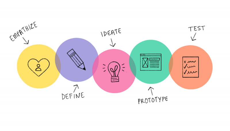
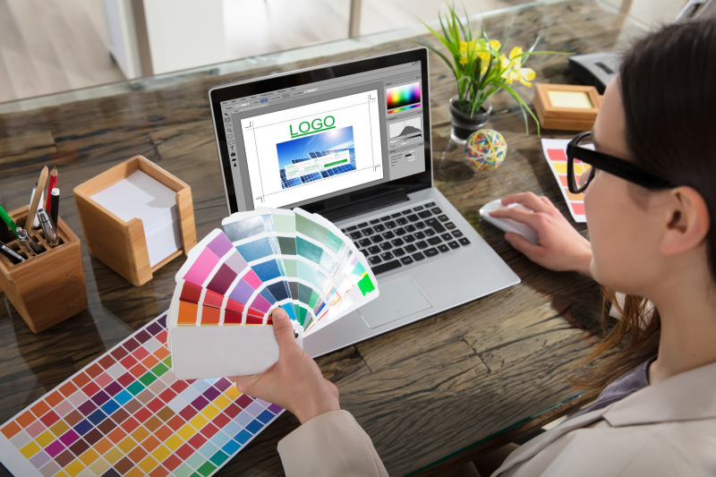
If you're looking for direction and support when designing, is advised to use one of the top tools for a logo design to simplify the process. You can still develop a beautiful logo for your brand even if you don't have access to a professional designer within your company. Each program or tool has a unique set of features that you may use to customize your logo to your preferences and requirements. This can help draw attention to details like your graphic's spacing and scaling which, if you're not a designer, you definitely wouldn't normally think about. A strong, iterative design process results in informed decisions, excellent end products, and delighted customers.

Utilize Available Design Tools 
Utilize Available Design Tools -
A fantastic tactic for expanding your business is to keep an eye on your competitors. Do some research on your competitors' logos to get ideas for your own design before you start. Analyze how their logos change over time and note any trends you notice.
Before even beginning to develop a logo design concept, it is advised to conduct extensive market research on your target audience. You may find specific branding standards that appear more frequently than others by carefully analyzing all logos comparable within your industry sector. This information can then inspire you to explore well-known visual associations while building your own design.

Research Your Competitors 
Research Your Competitors -
A memorable logo is important for a company's success, but it's not everything. Think about your whole brand identity before you start designing. To maintain recognition of your branding, make sure your logo colors are consistent with those used on your website, in your content, and in your marketing materials.
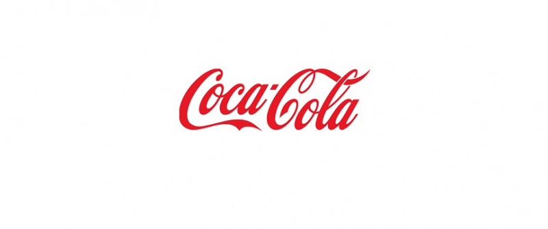
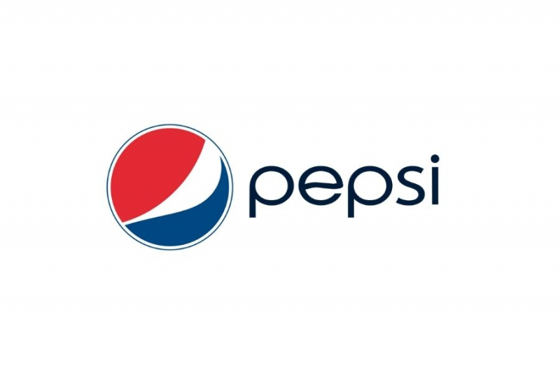
Pay close attention to the colors in your logo. Choosing black and white implies a simple or traditional design while choosing a single color for your logo can help people relate that color to your company (think Coca-Cola). Alternately, using 2-3 different colors can make your brand look more experimental. But keep in mind that your logo should look well in both black and white and any other color. This is a fundamental design guideline, and it's crucial if your business will be advertised in colorless print.
Keep Colors Consistent With Your Brand Identity 
Keep Colors Consistent With Your Brand Identity -
When designing your logo, make the most of the space you have at your fingertips while also allowing it some breathing room. If you choose to include a frame in your logo, for instance, ensure sure there is sufficient space between the icon, text, and frame. To make additional room, simply make the frame bigger or the contents smaller.
Utilize any white space to potentially create a bigger impact. Consider the FedEx logo as an excellent illustration of this; if you look closely, you can see that the white space between the E and X symbolizes an arrow, which neatly conveys the brand's objective. Your logo's elements should also be balanced and all oriented in the same direction (left, center, or right). To keep your logo looking professional, pay close attention to symmetry and negative space.
Explore the Space You Have—or Don’t Have 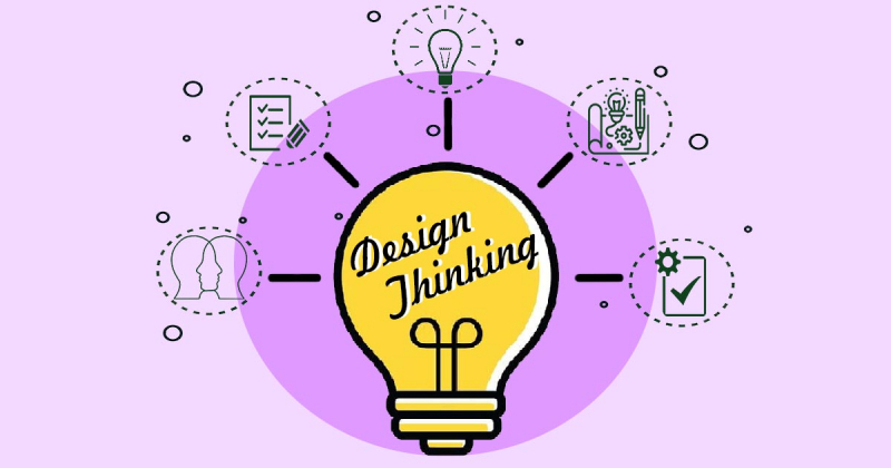
Explore the Space You Have—or Don’t Have -
A logo's design involves more than just selecting a relevant image and adding your company name on the top. Business logos that convey the spirit of your company by simplifying the visuals are good logos. Try to think of other ways your logo might represent your brand other than just utilizing a picture that demonstrates what your product or service is.
The Nike logo is a fantastic illustration of this. The sportswear company chooses to convey speed and movement with the swoosh icon rather than a picture of a runner or a pair of sneakers. This fits in with the golden rule of logo design stated by Wix: your icon should be straightforward enough that customers can remember it even after a quick scan. It is both innovative and immediately recognized.
Experiment With Conceptual Imagery 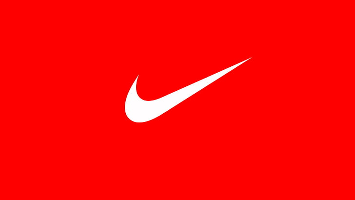
Experiment With Conceptual Imagery -
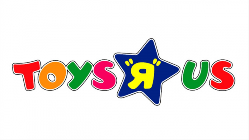
According to Marty Neumeier in his book The Brand Gap, "A brand is not what you say it is; it's what they say it is". While your brand logo should strive to personify your company's mission and values, it's as crucial to make sure that it continues to be appealing and relevant to your target audience.
Make sure that any images, icons, fonts, or colors you use in your design are appropriate for your business and take into account the preferences of your target market in order to achieve this. Consider the Toys "R" Us logo as an illustration. The prominent reverse R, funny typeface, and kid-friendly color scheme ensure that it remains appropriate for its young readership. This logo works well since it is still easily recognized and appeals to the brand's younger target market.
Ensure It’s Representative 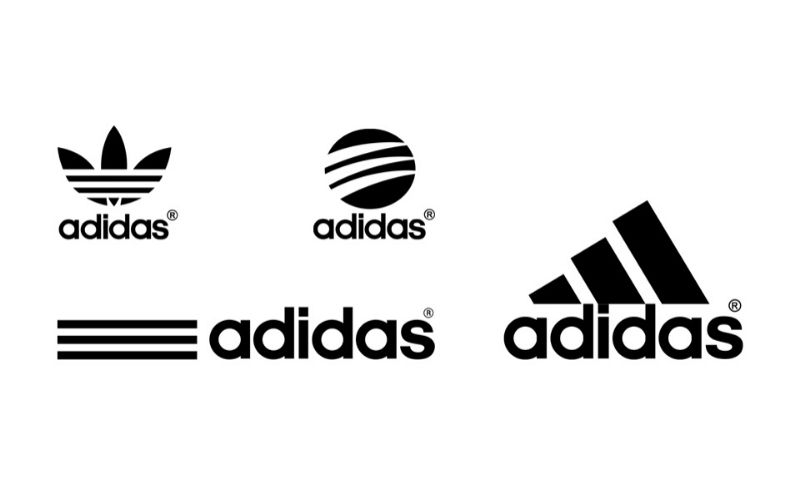
Ensure It’s Representative -
Consider your font choice carefully. Consider elements like size, uppercase and lowercase letters, and overall readability when thinking about typeface in addition to the typeface itself.
As your logo will be used on marketing and branding materials, make sure the wording can be read everywhere it is used. Examine how well it can be read on your website, Instagram, Facebook, as well as mobile and tablet devices. Also take into account the different typefaces, such as serif, sans-serif, and script, which are available. Which typeface best captures the spirit of your business? Should it be clean and significant? Or are you aiming for something more humorous and enjoyable? Think about both uppercase and lowercase letters. Uppercase lettered logos are recognized for conveying a greater feeling of power, whilst lowercase lettered logos suggest a more friendly, informal organization.
Think About the Font 
Think About the Font -
The tone of your brand can be summed up in a few words or short, short phrases called taglines. While it may be tempting to incorporate as much information as possible, it will have a greater impact if you keep your tagline as brief as possible so that it is consistent with the length of your company name.
Ultimately, you want to ensure aesthetic harmony here; your slogan should be smaller than your name while still precisely matched. Aim for a tagline that is no more than 25 to 30 characters at most, and think about using a thinner, less-bulky font t so that it doesn’t overrun the length of your name. By making your name or tagline the same size so that they both appear the same length, you can also fix spacing concerns.
Consider the Length of Your Tagline 
Consider the Length of Your Tagline -
In his book The Elements of Logo Design, Alex White claims that a good logo lasts for at least ten years. Though fads come and go, a classic logo never goes out of style, so if you're tempted by emerging trends in design, stop and consider this.
Having to rework your logo may have a negative impact on your target market's impression of your business. It's important to design a logo that will last. Use no more than three colors and more traditional fonts to maintain a classy appearance. While you can always make little changes to your logo as your company grows, avoiding fashion fads and other design missteps can maintain your company's image classic.

Keep It Timeless by Avoiding Trends 
Keep It Timeless by Avoiding Trends -
A strong logo for a business is one that is flexible. You want to create something that will appear good in any context and maintain its sharp, recognized borders when enlarged or reduced. Scaling down intricate or extremely detailed logos can be difficult, so bear that in mind when creating.
A high-resolution vector should be used for your logo so that it may be scaled to fit different sizes. This will keep it adaptable and help your brand become more visible in various commercials and marketing materials. The size of any icons used should also be taken into account. Keep icons at the same height as the text in your logo, if not slightly larger. By doing this, the icon will remain visible even when it is shrunk.
Stay Versatile and Scalable 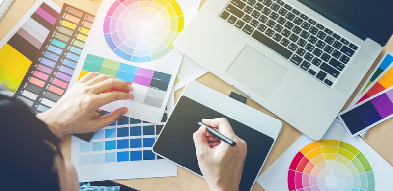
Stay Versatile and Scalable