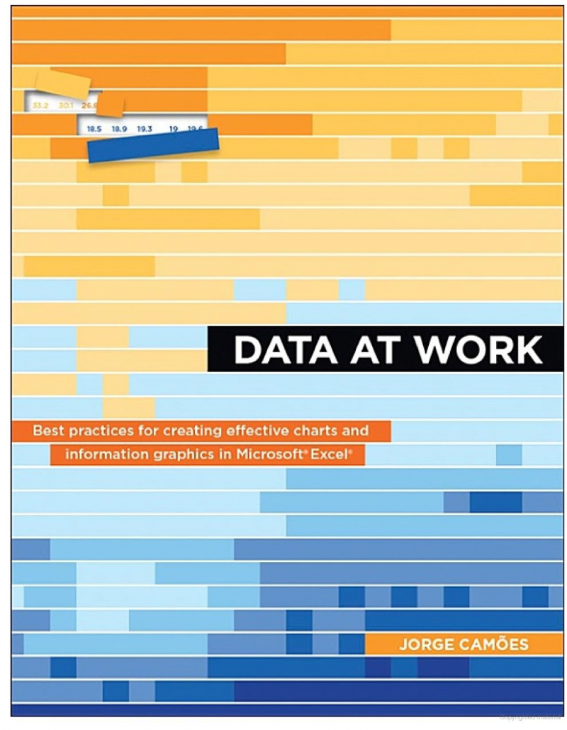
Data at Work
If you're an Excel nerd and enjoy visualization, you'll want to add this book to your library. Regardless of the spreadsheet application students use or whether they have any design knowledge, Data at Work will assist them in determining which sort of chart to use and how to format it. They'll learn how to extract, clean, and convert data, sort data points to spot trends and detect outliers and utilize a range of data visualizations, such as bar charts, slope charts, strip charts, scatterplots, and bubble charts, boxplots, and more, in this book. Because this is not a handbook, the processes for creating a chart are never specified, but the appropriate charts will be accessible for students to download online, along with brief descriptions of how they were generated.
A wonderful review of visual perception and information theory, with a focus on business communication. It covers topics such as preattentive qualities, colors, and how to select the best graphic for your data. Cames gives links to all of his examples, which were created in Excel, the most widely used program. So users don't get the impression that they require Tableau or Adobe Illustrator to create anything attractive.
The book is not an Excel how-to, but you may download and examine his charts using the links. It's all about picking the ideal design, speaking clearly, and having your visualizations stand out instead of looking like every other Excel chart. He also advises against depending just on the default chart gallery.
One reader commented: I'll say it again: When it comes to Data Visualization Theory, this book is a "bible." A good comprehensive current resource in visualization, I periodically refer to numerous specified frameworks when working on a project, particularly the Jorge chart categorization, which I find extremely useful.
Author: Jorge Camões
Language: English
Link buy: https://www.amazon.com/Data-Work-practices-effective-information/dp/0134268636


