Top 15 Best Books On Data Visualization

While new technologies arise and old ones develop, many essential data visualization best practices remain timeless, including color selection, axis ... read more...orientation, the appropriateness (or gratuity) of animation or interactivity in a particular context, and much more. "A lot of what changes is simply software," said Alli Torban, a data visualization consultant in Washington, D.C. "But a lot of the fundamentals remain pretty similar." "A book that is ten years old can still teach you a lot." Check out the list below for some of the best books on data visualization that have a long shelf-life.
-
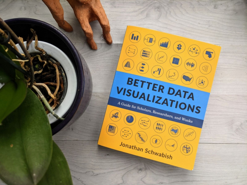
Better Data Visualizations, published in early 2021 and featuring a great diversity of visualizations (over 500 examples), it's one of the best books on data visualization because reads like a fun and instructional encyclopedia of graphs.
This book explains how to produce more effective data visualizations using key methods. There are three portions to the book. It starts with a quick rundown of the best practices for data visualization. The core of the book is in Part 2: chart kinds. Schwabish delves into a variety of graphs that go well beyond the traditional lines and bars. In several instances, he provides an intelligent assessment of why and when each works - and when it doesn't. The last section delves into design and offers advice on how to create and use a data visualization style guide.
Jonathan Schwabish takes readers through the processes of making better graphs, including how to go beyond the basic line, bar, and pie charts. He illustrates the dos and don'ts of data visualization, the foundations of visual perception, and how to make subjective style judgments surrounding a chart's design through over 500 examples. From histograms to horizon charts, ridgeline plots to choropleth maps, Schwabish examines more than eighty visualization patterns and explains how they fit within the visual toolkit. Although it may appear difficult, anybody can learn to produce engaging and effective data visualizations. This book will help you establish your audience and goals, select the appropriate graph for your data, and explain your message properly.
"This is a really useful tutorial on using data visualization to communicate more effectively. This book will be an important and easy read for everyone who wants to transform data into knowledge, from basic concepts to a comprehensive taxonomy of visualization kinds to building a style guide." -- Mara Averick, RStudio.
Author: Jonathan Schwabish
Language: English
Link buy: https://www.amazon.com/Better-Data-Visualizations-Scholars-Researchers/dp/0231193114
www.amazon.com 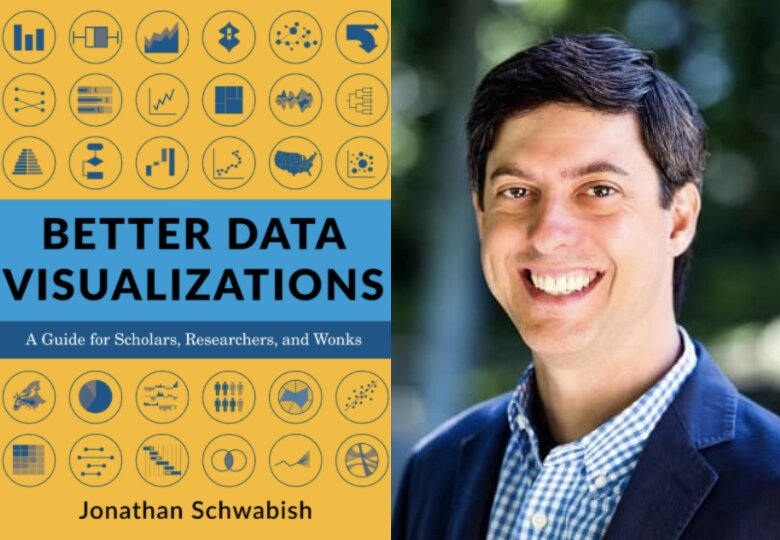
twitter.com -
The Good Charts Workbook is the hands-on guidance you've been waiting for if you're ready to produce your own "good charts"—data visualizations that effectively convey your ideas and research while also advancing your career. Because it includes hands-on practice, this is an excellent book for a beginner practitioner.
It's written in a way that makes you feel like Berinato is a helpful mentor or coworker who is just guiding you through the process. It contains quiz-like prompts, such as why a certain pie chart is difficult to understand and what may be done to improve it. Then there's a sketch area where you may draw what you'd rather do. Because the data sets he provides are simple, you can quickly draw them.
With warm-up exercises and mini-challenges for each, Harvard Business Review Senior Editor and DataViz expert Scott Berinato walks you through the key challenges in creating good charts—controlling color, crafting for clarity, choosing chart types, practicing persuasion, capturing concepts—step by step. Throughout the Workbook, users will find useful suggestions and reminders, as well as white space to practice the Good Charts talk-sketch-prototype approach. The Good Charts Workbook is a must-have guide for bettering your grasp of DataViz and developing better charts to help you make your case.
The original book, Good Chart Workbook has received a lot of praise, for example: "An alternative to 'death by PowerPoint,' this is an excellent work... a complete and appealing introduction to the topic." -- Choice.
Author: Scott Berinato
Language: English
Link buy: https://www.amazon.com/Good-Charts-Workbook-Exercises-Visualizations/dp/1633696170
www.amazon.com 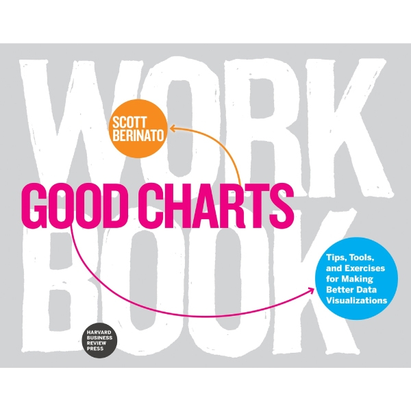
twitter.com -
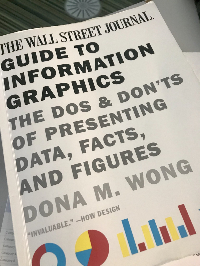
In today's data-driven environment, professionals must be able to efficiently and eloquently convey themselves in the language of graphics. Information graphics, on the other hand, is rarely taught in schools or the subject of on-the-job training. Dona M. Wong, a student of information graphics pioneer Edward Tufte, now makes this content available to all of us for the first time. The Wall Street Journal Guide was published on December 16, 2013, was an outstanding success in this field and became one of the best books on data visualization.
The Wall Street Journal Guide to Information Graphics is written from the standpoint of a journalist, with guidelines for creating effective charts for the media. It's also incredibly useful for folks who don't have a strong foundation in data. Wong's concrete examples address specific, everyday problems. There's a section on excellent y-axis increments, for example, which describes what an uncomfortable increment looks like and what to do instead. There's also a section on log scales that's useful. The subtitle of the book is quite prescriptive: the dos and don'ts. If you're searching for a place to start, this is a wonderful place to start because it's full of examples.
Dona Wong also explains arithmetic topics extremely clearly, such as how to compute a percent change, which is something you'll need to do if you're constructing a chart. However, if you don't have a math background, it might be complex and difficult to locate by Googling. The book is structured as a series of mini-workshops with accompanying illustrations, so you may not only learn what works and what doesn't but also see the dos and don'ts for yourself. This is a must-have resource for students and professionals in all professions.
Mark Zandi, chief economist, and Moody’s Economy.com gave flattering for this book: "We live in a data-driven society, and Dona Wong does an excellent job of demonstrating how to bring statistics to life and appealingly express the facts."
Author: Dona Wong
Language: English
Link buy: https://www.amazon.com/Street-Journal-Guide-Information-Graphics/dp/0393347281
twitter.com 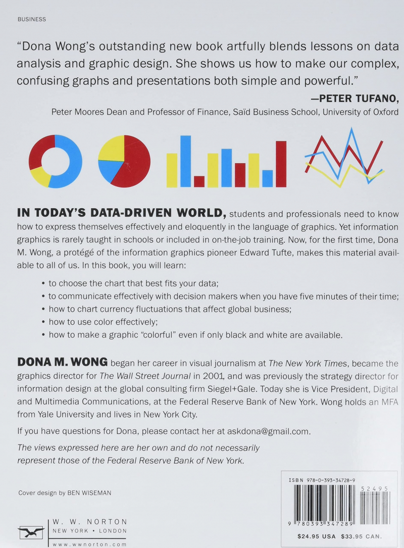
www.amazon.com -
When it comes to the best books on data visualization, it's impossible not to mention How Charts Lie composed by Alberto Cairo, a top data visualization specialist who investigates the negative and positive effects of charts on our view of reality.
"A thousand words are worth a thousand pictures, but only if you know how to read them. Alberto Cairo tells us how to become more knowledgeable about visual information by reading charts with care and attention. I discovered a lot of things to take here, and I'm sure you will as well."— Austin Kleon is the author of the book Steal Like an Artist.
Numbers are increasingly driving public debates nowadays. While charts, infographics, and diagrams might help us learn more, they can also trick us—intentionally or not. We must all be able to comprehend and utilize the visual information that politicians, journalists, and even our employers offer us daily to be informed, citizens. Avoid allowing evil actors to readily change graphics to further their objectives.
Alberto Cairo, a data visualization expert, tells us how to not only recognize the falsehoods in misleading graphics but also how to use excellent ones to grasp complicated tales in his book How Charts Lie. Numbers are increasingly driving public discourse, and we must be able to decipher and use visual information to make sense of them. By covers, modern examples ranging from election result infographics to global GDP maps and box office record charts, as well as an updated afterword on the visuals of the COVID-19 epidemic, demystifying a vital new literacy for our data-driven society.Author: Alberto Cairo
Language: English
Link buy: https://www.amazon.com/How-Charts-Lie-Getting-Information/dp/1324001569
www.amazon.com 
twitter.com -
Ben Jones is the founder and CEO of Data Literacy, LLC, which runs DataLiteracy.com and is on a mission to help individuals master the language of data. Ben is also a data visualization instructor at the University of Washington and the author of the book 'Avoiding Data Pitfalls', which is a reputation-saving manual for data professionals, designed to help you avoid the all-too-common missteps in data analysis, visualization, and presentation.
There are a plethora of data tools available, as well as books on how to utilize them—but unless you fully grasp how to deal with data, each of these tools can eventually mislead you and lead to costly blunders. This book takes you through the whole data visualization process, from computation and analysis to accurate and meaningful presentation, step by step. Common errors are dissected in detail to show you how they develop, how they've grown so widespread, and how you may prevent them right away. Then, and only then, can you make use of the multitude of tools available—in the hands of someone who understands what they're doing, the appropriate tools may significantly reduce the time, work, and numerous decisions that go into every data presentation?
Each chapter focuses on a particular risk, detailing the unique dangers and providing examples to assist you to learn how to spot and avoid them. Even though there is only one chapter dedicated to data visualization (pitfall No. 6: graphical gaffes), the book highlights the sorts of questions and thinking processes that anyone who visualizes data should be considering while examining their data throughout the book. The lessons described are excellent for people who are just getting started with data analysis and visualization, but they also serve as a helpful reminder of concerns that more experienced analysts may overlook.
"This is the most intimate data we've ever seen. Avoiding Data Pitfalls by Ben Jones isn't just a rehash of classics like How to Lie With Statistics; it's a refreshing, honest, idiosyncratic, and deeply humane look at the challenges we all face when gathering, analyzing, or presenting data, written from the perspective of a professional who's seen and erred a lot and isn't afraid to admit it." —Alberto Cairo, co-author of the book How Charts Lie.
Author: Ben Jones
Language: English
Link buy: https://www.amazon.com/Avoiding-Data-Pitfalls-presenting-visualizations/dp/1119278163
twitter.com youtube.com -
Info We Trust is for anybody interested in bridging the gap between data and people: data visualization experts, analysts, and anyone who wants to understand the world in new ways. Andrews talks about piquing your audience's interest at one point. Good storytelling, he argues — and I'm paraphrasing — gives room for the audience to form connections. The book itself accomplishes this well, presenting accurate insights while leaving leeway for the reader to connect and extrapolate to their work.
This book takes mathematical and lyrical inspiration from the whole of human existence. It offers advanced strategies for creating more human-like data visualizations, such as visual metaphors and data transformations. It also demonstrates how print advertising, engineering, museum curating, and mythological archetypes can all teach us something. This human-centered approach collaborates with machines to provide knowledge that is useful to humans. Expand your knowledge by learning from a long tradition of putting things "in shape" to generate new and interesting ways of looking at the world.
Info We Trust offers a unique approach to the art of informing. It's based on decades of best practices and infused with the creative zeal of a master data storyteller. Hundreds of creative compositions adorn Info We Trust, illuminating the trade, delighting the reader, and inspiring a new generation of data storytellers.
"Info We Trust elevates the art of numerical design to a poetic level. Data visualization requires a book like this, with an essay that is both beautiful and distinctive."—Alberto Cairo, University of Miami's Knight Chair in Visual Journalism.Author: RJ Andrews
Language: English
Link buy: https://www.amazon.com/Info-We-Trust-Inspire-World/dp/1119483891
www.amazon.com 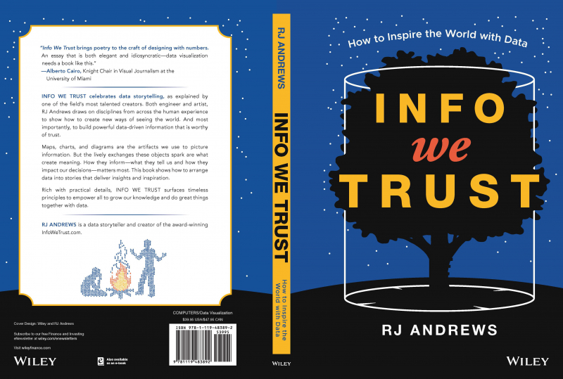
twitter.com -
This book should be read by everybody who works in a business intelligence team. The Big Book of Dashboards, co-authored by Steve Wexler, Jeffrey Shaffer, and Andy Cotgreave, is the authoritative guide on designing excellent dashboards. The writers have a combined 30-plus years of expertise working with people in hundreds of businesses to create successful visualizations. They've been through many 'best practices' conflicts and come out on the other side with a rare empathy to assist you, the reader of this book, to survive and prosper in the world of data visualization.
The Big Book of Dashboards became one of the best books on data visualization because this is the ideal book for business analysts, with a plethora of real-world dashboard examples organized by scenarios: a sales dashboard for executives, rankings over time, complaint monitoring, and churn — all of which are things that you do in the real world. Each chapter contains an example and an explanation of why that dashboard works, as well as detailed discussions on different practical and design aspects across each part. When co-authors dispute within a chapter, it's beneficial to hear both viewpoints.
This book is great for individuals who want to take their dashboard design abilities to the next level, with several examples based on genuine use-cases of dashboards from diverse industries, such as health, finance, marketing, and sports. It covers best practices for developing dashboards, from empathizing with the audience to improving data visualizations inside a dashboard, and is specifically geared toward Tableau users.
Comment for The Big Book of Dashboards: "This book is chock-full of stunning dashboards as well as really practical information from three writers with decades of expertise. It's a gold mine for data-viz aficionados and corporate executives looking to improve their data presentation skills to improve operations."—J.D. Whitlock, VP, Enterprise Intelligence, Mercy Health.Author: Steve Wexler, Jeffrey Shaffer, and Andy Cotgreave
Language: English
Link buy: https://www.amazon.com/Big-Book-Dashboards-Visualizing-Real-World/dp/1119282713/
www.amazon.com 
twitter.com -
If you're an Excel nerd and enjoy visualization, you'll want to add this book to your library. Regardless of the spreadsheet application students use or whether they have any design knowledge, Data at Work will assist them in determining which sort of chart to use and how to format it. They'll learn how to extract, clean, and convert data, sort data points to spot trends and detect outliers and utilize a range of data visualizations, such as bar charts, slope charts, strip charts, scatterplots, and bubble charts, boxplots, and more, in this book. Because this is not a handbook, the processes for creating a chart are never specified, but the appropriate charts will be accessible for students to download online, along with brief descriptions of how they were generated.
A wonderful review of visual perception and information theory, with a focus on business communication. It covers topics such as preattentive qualities, colors, and how to select the best graphic for your data. Cames gives links to all of his examples, which were created in Excel, the most widely used program. So users don't get the impression that they require Tableau or Adobe Illustrator to create anything attractive.
The book is not an Excel how-to, but you may download and examine his charts using the links. It's all about picking the ideal design, speaking clearly, and having your visualizations stand out instead of looking like every other Excel chart. He also advises against depending just on the default chart gallery.
One reader commented: I'll say it again: When it comes to Data Visualization Theory, this book is a "bible." A good comprehensive current resource in visualization, I periodically refer to numerous specified frameworks when working on a project, particularly the Jorge chart categorization, which I find extremely useful.Author: Jorge Camões
Language: English
Link buy: https://www.amazon.com/Data-Work-practices-effective-information/dp/0134268636
www.amazon.com 
twitter.com -
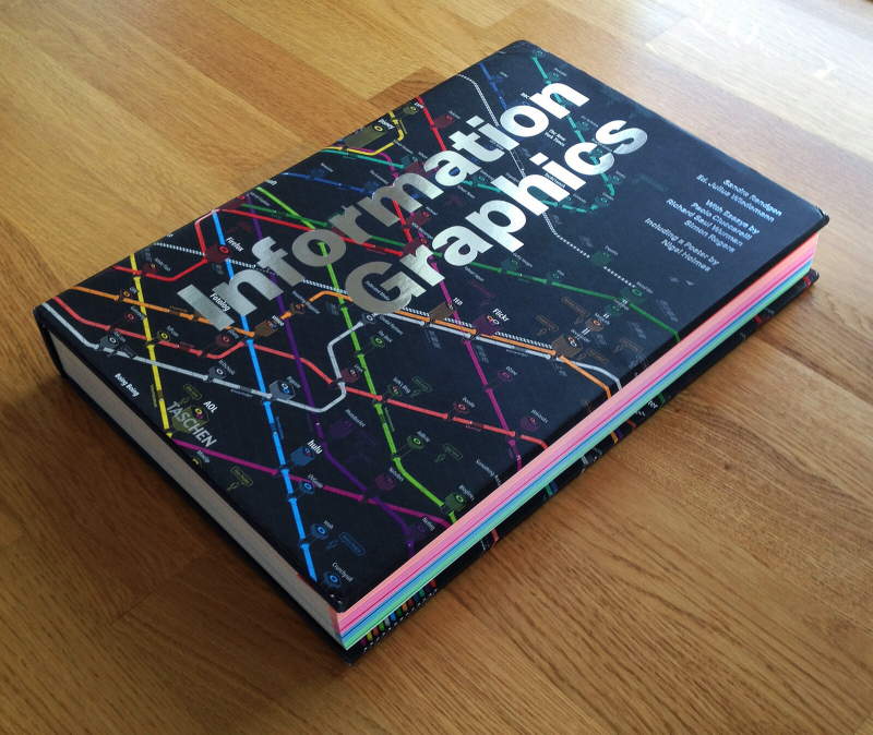
Information Graphics is an interesting, beautifully written book about the evolution of visual communication in the age of big data. Anyone interested in the history and practice of modern visual communication would find this valuable, as it was conceived and created for a broad audience.
Our daily lives are flooded with vast amounts of data that we must decipher to comprehend the world we live in. Given the vast diversity of data that surrounds us, visual communication is sometimes the greatest, if not the only, method to communicate. This one-of-a-kind book offers a fresh viewpoint on the subject, spotlighting the work of the industry's masters, innovators who have altered the way we interact. Information Graphics was created not just for graphic designers, but for anybody interested in the history and practice of visual communication.
The book is divided into two sections and co-authored by Sandra Rendgen and Julius Wiedemann. The first features introductory pieces on the early history of data visualization (one of the studies, for example, looks at prehistoric cave drawings as a way of communication) as well as the ideas that drive it. The second section contains over 200 projects and 400 examples of graphical data from across the world, including disciplines like media, government, education, business, and more.
"It's a daring book that doesn't hide behind a plethora of visual design examples, but instead provides a classy framework for showcasing the many fantastic instances of data narrative. It's a book to leaf through, leap through, and flip through, a publication you'll have in your hands for a long time and return to enjoy or, more importantly, recharge your design batteries." ― Urban Tick.Author: Sandra Rendgen
Language: English
Link buy: https://www.amazon.com/Information-Graphics-Sandra-Rendgen/dp/3836528797
www.amazon.com 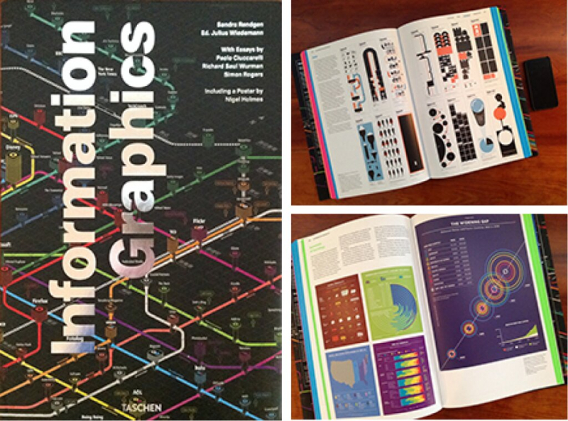
twitter.com -
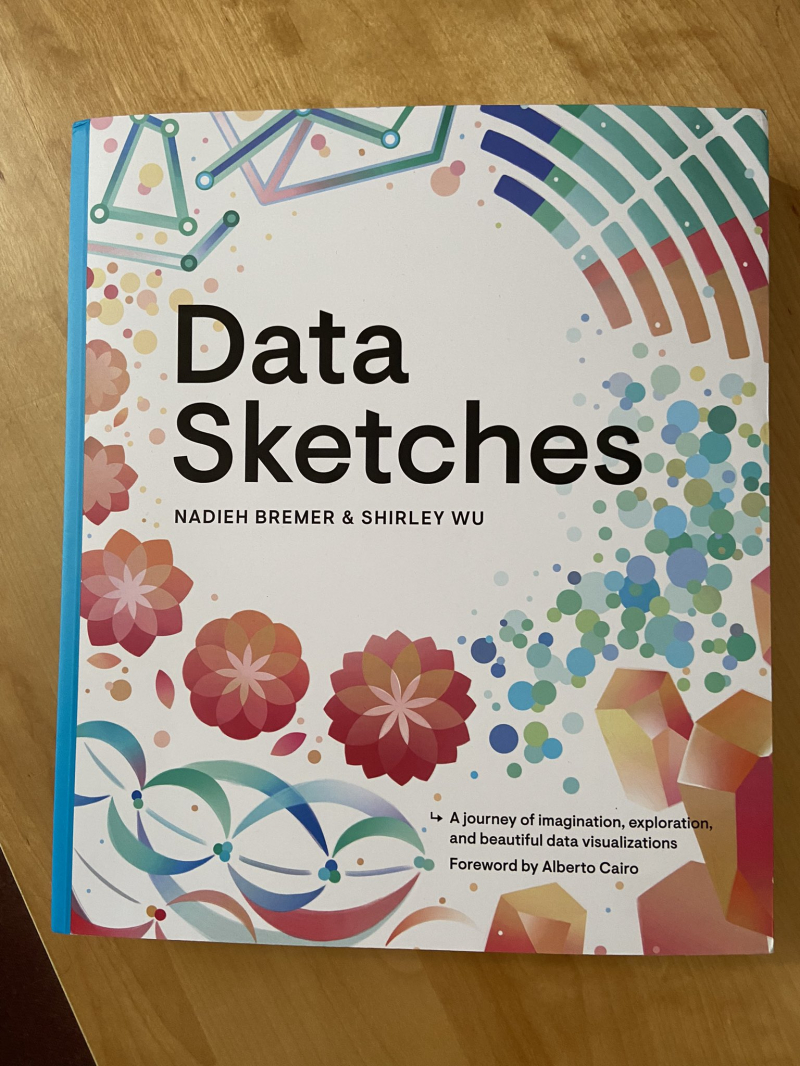
Ranked twelfth on this list the best books on data visualization are Data Sketches. It's a tour de force — think coffee table book meets tech — and a terrific book to read if you've dabbled in data visualization and want to take it to the next level. It's a fantastic resource for folks who wish to advance in their careers.
The book is a combination of memoir (for the most part), technical book, and design book. With it, you won't be able to "learn" data visualization (although you might learn some interesting concepts, tips, and interesting approaches). However, you'll be immersed in the work of two excellent specialists. And, most importantly, you'll be motivated to learn more, experiment more, and explore new ways, regardless of where you are in your data viz journey.
Nadieh Bremer and Shirley Wu's book Data Sketches documents the deeply creative process behind 24 different data visualization projects, combining it with significant technical insights that expose the mindset behind coding creatively. Each pair of visualizations explores new technologies and styles, blurring the line between visualization as an exploration tool and an art form in its own right, with subjects ranging from the Olympics to Presidents & Royals and Movies to Myths & Legends. Every step along the process, the authors' notes, and drafts are shared in this lovely book, which gives an intimate, behind-the-scenes overview of all 24 projects.
Nathan Yau, Creator of FlowingData and Author left a comment saying that: "Data Sketches, a collaboration between Nadieh Bremer and Shirley Wu, is an excellent illustration of what you can accomplish with data visualization beyond a typical chart. They demonstrate that visualization may be both practical and pleasing to the eye. They demonstrate the numerous possibilities that may be realized when data and graphics are carefully considered. The finest part of Data Sketches is that Bremer and Wu chronicled their procedures so that you can learn about the tools they used, the data's messiness, and how they got over the roadblocks."Author: Nadieh Bremer and Shirley
Language: English
Link buy: https://www.amazon.com/Data-Sketches-AK-Peters-Visualization/dp/0367000121
www.amazon.com 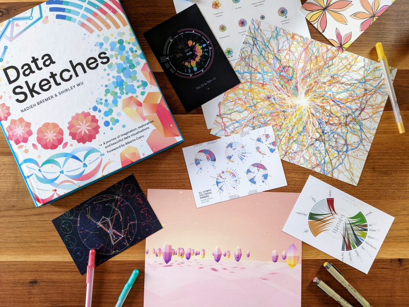
twitter.com -
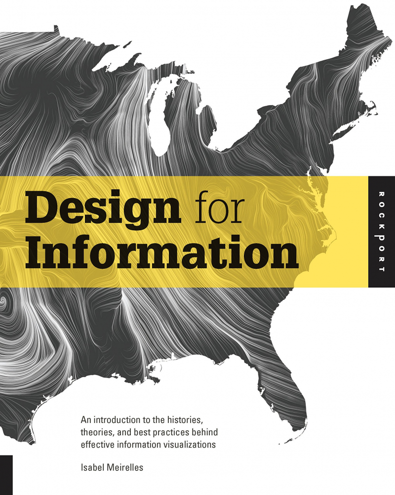
To comprehend a subject, one must return to the classics at some time. Design for Information by Isabel Meirelles is a meticulously selected journey through the realm of visualization, mostly from the perspective of a designer, but with a broad scope. It's more than simply a gorgeous coffee table book; it delves deep into the concepts.
This book describes how humans interpret information visually, as well as the many ways to display data – charts, maps, network diagrams, a variety of flowcharts, trees, and other visual representations of data that aren't always tables of data. It's aimed towards [data-viz] professionals, rather than, for example, a product manager or someone who just works with Excel charts. This is more complex, such as when creating timelines of your company's history.
The definitions of structure - relational, hierarchical, geographical, temporal, or textual structures — haven't changed in over a decade. Whether you use R or Tableau or create by hand, the concepts of successfully communicating in a certain form are universal and tool-independent.
"Northeastern University's Meirelles has made a significant contribution to the field of information design. Edward Tufte's books Visual Display of Quantitative Information (CH, Nov'83), Envisioning Information (CH, Nov'90, 28-1398), and Visual Explanations (CH, Jul'97, 34-6236) were published in the 1980s and 1990s. A book on information design hasn't promised such a leap forward since Tufte's work. The key is the meticulous categorization of data into six different "structures." "Hierarchical Structures: Trees," "Relational Structures: Networks," "Temporal Structures: Timelines and Flows," "Spatial Structures: Maps," "Spatio-Temporal Structures," and "Textual Structures" are the six-chapter names that represent this. This book, which is both well-illustrated and well-written, will most likely become the standard for teaching information design. This is an important reference in the topic, including an appendix, full bibliography, and comprehensive index. It also contributes to graphic design theory in general since its structural categorization may be used for all types of visual communication. To summarize: "Important."― Choice.Author: Isabel Meirelles
Language: English
Link buy: https://www.amazon.com/Design-Information-Introduction-Histories-Visualizations/dp/1592538061
www.amazon.com 
twitter.com -
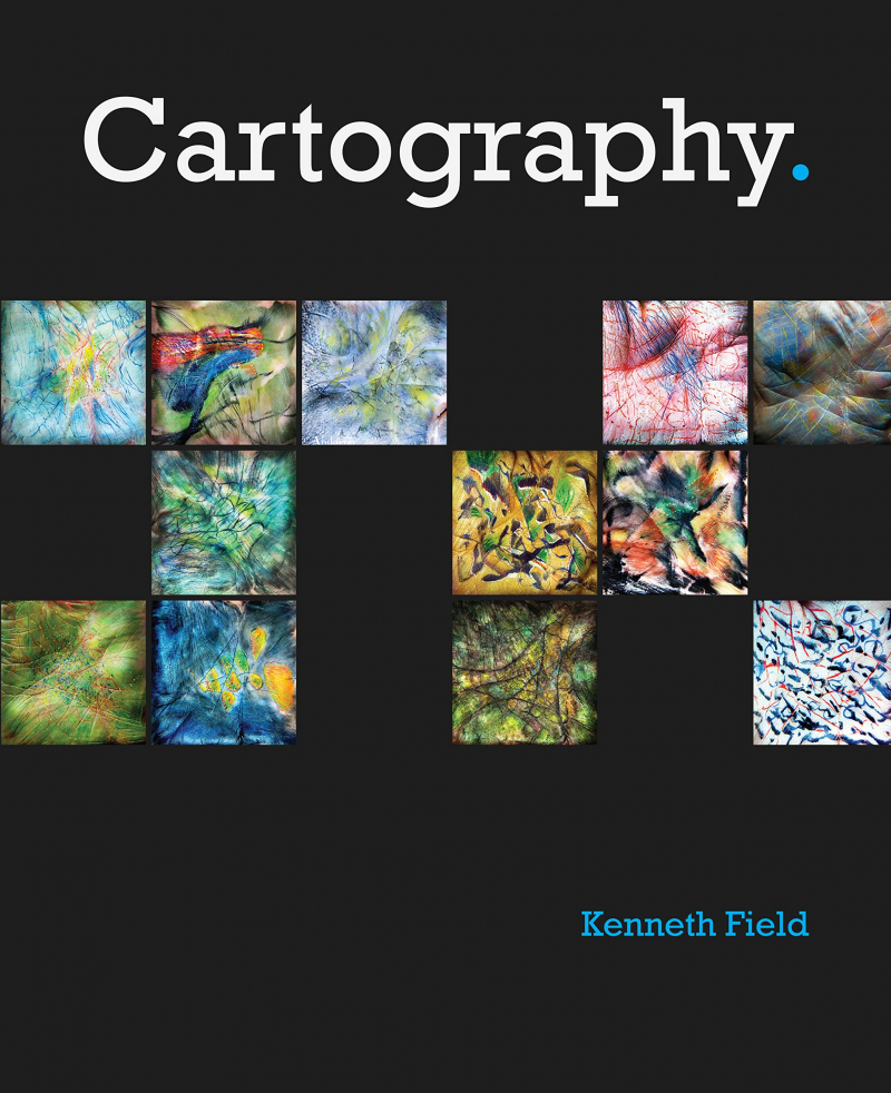
Cartography written by professional cartographer Kenneth Field is an exciting and creative companion along the nonlinear road toward building a wonderful map. This is one of the most outstanding novels I've ever read. That's not simply because of the book's size — it has over 500 pages of substance — but also because of Field's careful structuring and organization of so much information in a way that doesn't overwhelm.
It is a lavishly illustrated reference guide. This wise compendium for modern mapmakers distills the core of cartography into practical themes, which are grouped for ease of discovering the precise concept or procedure you want. Unlike works that focus on deep scholarly discussions of cartographic theory, this book offers solid, aesthetically appealing material that translates into practical and usable tools for modern mapmaking. This book, which sits at the crossroads of science and art, provides us with a roadmap for creating a precise and useful map.
Each two-page spread focuses on a different facet of the story (for example, a map type or design principle). The text is coupled with a range of attractive visuals and is designed for simple scanning. Color-coded and alphabetized topics make it simple to locate items of interest or investigate an idea that piques your interest. It turns out that much of the design logic that goes into developing a successful map can also be used for graphical data visualization."Read the book if you want practical guidance or if you want to broaden your horizons; it did both for me."― Menno-Jan Kraak, president of the International Cartographic Association (ICA); professor, University of Twente, Enschede, Netherlands; author of Mapping Time and coauthor of Cartography, Visualization of Geospatial Data.
Author: Kenneth Field
Language: English
Link buy: https://www.amazon.com/Cartography-Kenneth-Field/dp/1589484398
www.amazon.com 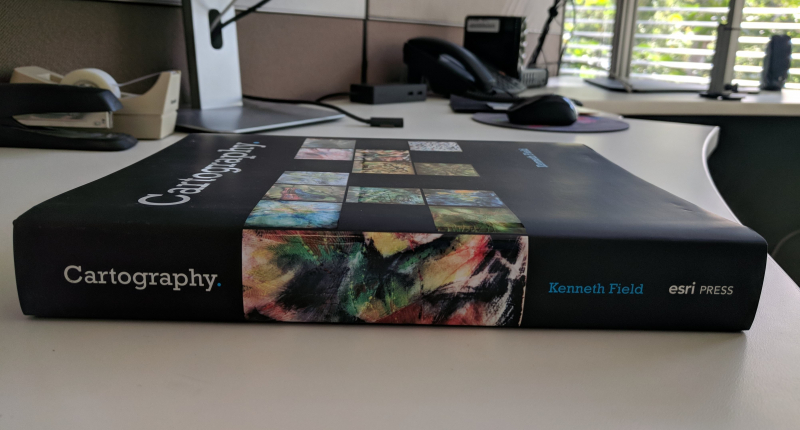
twitter.com -
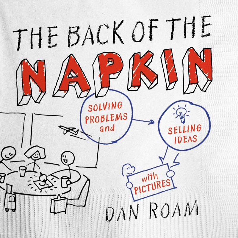
"There is no more effective approach to demonstrate our understanding of something than to make a simple image of it. Picking up a pen and drawing out the elements of our problem is the most powerful method to find hidden answers." So writes Dan Roam in The Back of the Napkin demonstrates how a simple sketch on a basic napkin can be more effective than the slickest PowerPoint presentation. Roam tells readers how to solve any problem or sell any concept using a basic set of tools, based on his twenty years of expertise and the most recent breakthroughs in visual science.
The "how" and "why" of communication with your customer, team, or prospect are on the back of the napkin. As the title says, this is a pretty visual book with a lot of graphics, acronyms, and techniques for drawing and having a discussion instead of death by PowerPoint. Dan Roam presents a standard collection of templates on how to visualize this to provide impact in your conversation by traveling through the 6 "W" questions (i.e. What, Who, When, Why, Where, and How). It's worth a read!
This is a timeless classic. Roam focuses on hand drawings to educate how to communicate visually. He uses diagrams, charts, maps, and visual explanations to dig into corporate communication. His visual thinking codex explains which charts and diagrams work best with different types of data. This updated version performs an even better job of letting you physically view the world in a new way, with more color, larger photographs, and extra material. Teachers, project managers, physicians, engineers, assembly-line workers, pilots, football coaches, maritime drill instructors, financial analysts, students, parents, and attorneys are among many who have recognized the value of using visuals to solve issues.
"A picture is worth a thousand words, as terrible as it is for any writer to realize. That is why I got so much out of this book. Dan Roam has written a sharp, practical primer on the potential of visual thinking with flair and humor."― Daniel H. Pink, author of A Whole New Mind.Author: Dan Roam
Language: English
Link buy: https://www.amazon.com/Back-Napkin-Expanded-Problems-Pictures/dp/1591842697
www.amazon.com 
twitter.com -
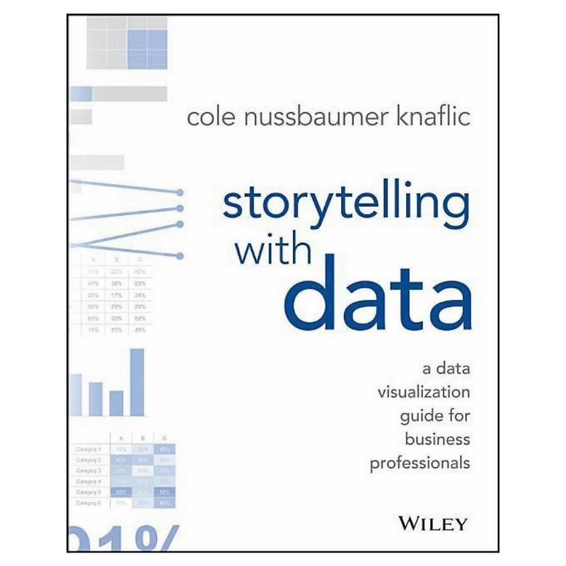
Cole Nussbaumer Knaflic uses statistics to tell tales. She is the founder and CEO of SWD and the author of the best-selling book, Storytelling With Data: a data visualization guide for business professionals, which has been translated into a dozen languages, is used as a textbook by over 100 universities, and is the course book for tens of thousands of SWD workshop participants.
Storytelling With Data: A Data Visualization Guide For Business Professionals teaches you the principles of data visualization as well as how to successfully communicate with data. You'll learn about the power of storytelling and how to use statistics to convey your tale. The ideas in this illuminating work are theoretically based, but they are made accessible through several real-world examples that may be used in your next graph or presentation right away.
Storytelling is not a natural talent, especially when it comes to data visualization, and the tools we have at our disposal don't help. This book shows how to go beyond traditional methods to get to the heart of your data, and how to utilize that data to tell a story that is interesting, instructive, and powerful. Offering so many lessons and insights about data, this book's inclusion in the list of the best books on data visualization is undeniable and is right.
Commendation for: "Storytelling with Data is a brilliant show of uncommon art in the corporate world, wonderfully written and masterfully executed. Cole Nussbaumer Knaflic has a special talent—a gift—for crafting stories with statistics. She has assisted JPMorgan Chase in improving our ability to communicate complex analyses to upper management and the regulators with whom we interact. Cole's book combines her skills into an easy-to-read handbook with outstanding examples that everyone may use to help them make better decisions."—Mark R. Hillis, JPM Chase's Chief Risk Officer of Mortgage Banking.
Author: Cole Nussbaumer Knaflic
Language: English
Link Buy: https://www.amazon.com/Storytelling-Data-Visualization-Business-Professionals/dp/1119002257
www.amazon.com 
twitter.com -
Are you ready to hone your data storytelling skills? Let's Practice! will help you gain confidence and credibility in your ability to generate logical graphs and visualizations and weave them into the action-inspiring narrative. Let's practice! builds on best-selling storytelling by including data's core concepts. It includes new information, a multitude of new examples, and over 100 hands-on activities. Cole Nussbaumer Knaflic, author and data storytelling expert, walks you through the steps to honing key abilities and becoming a skilled data communicator.
The lessons and activities in this comprehensive book will help you master — or build in others — data storytelling abilities and elevate your work from good to great. We can all tell fascinating and powerful data tales by investing in these abilities for ourselves and our teams! It takes effort to become proficient at interacting with data, and this book will assist you in that endeavor. SWD community, an interactive online companion resource, is also open to everyone.
"This is a fantastic book. Don't be tricked into thinking it's just a collection of practice activities to go along with the first book. Let's Practice! is a gold mine of information on change management, collaboration, leadership involvement, feedback, iteration, and how to think critically about the organization's and stakeholders' priorities. Cole provides step-by-step directions for defining your audience, determining their requirements, and crafting engaging and enlightening narratives." —Author of The Big Book of Dashboards, Steve Wexler.
Author: Cole Nussbaumer Knaflic
Language: English
Link buy: https://www.amazon.com/Storytelling-Data-Cole-Nussbaumer-Knaflic/dp/1119621496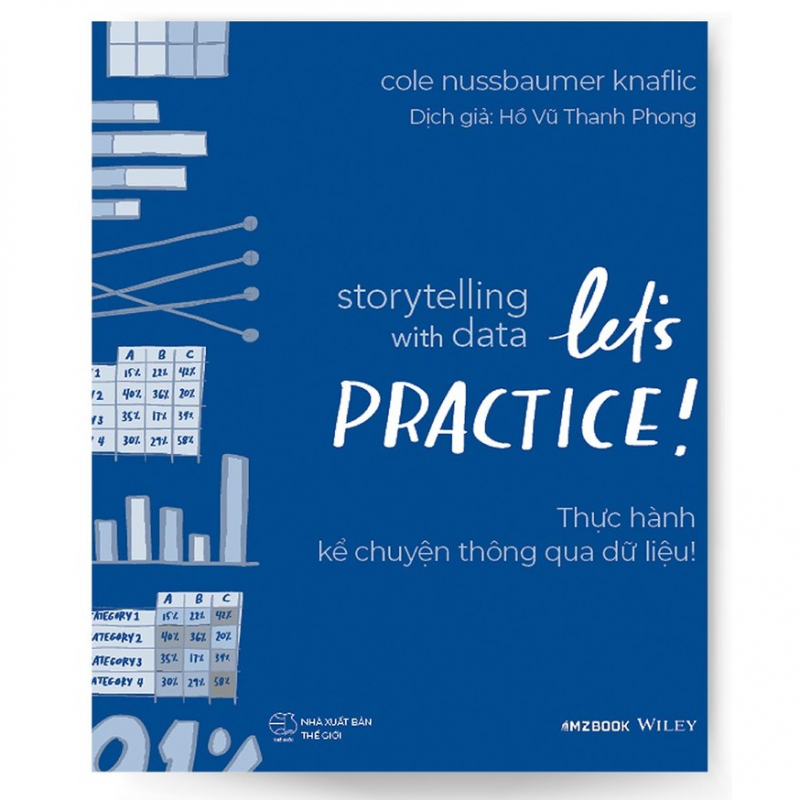
www.amazon.com 
twitter.com